A third year University project, which consisted of redesigning a range of Teapigs' tea packaging. The project involved designing and crafting the packaging itself, as well as showcasing the online presence of the rebrand for Teapigs and any accompanying promotional material. Teapigs as a company, are unique, with their tea full with big flavour, through the use of their 'tea temples', which hold whole tea leaves, compared to regular tea bags, making their cup of tea a rather delightful one. In particular, this project decided to rework a selection of Teapigs' herbal tea range, with the aim of bringing their existing packaging to life, so that their wonderful tea flavours, stand out better on the shelf, which can in turn promote their tea range better. Within the redesign of the herbal range, 4 flavours had their packaging redesigned, whilst an accompanying website was also developed to showcase the online presence of Teapigs, with promotional collateral such as mugs and coasters, also being designed to showcase the new identity across a wide range of items.
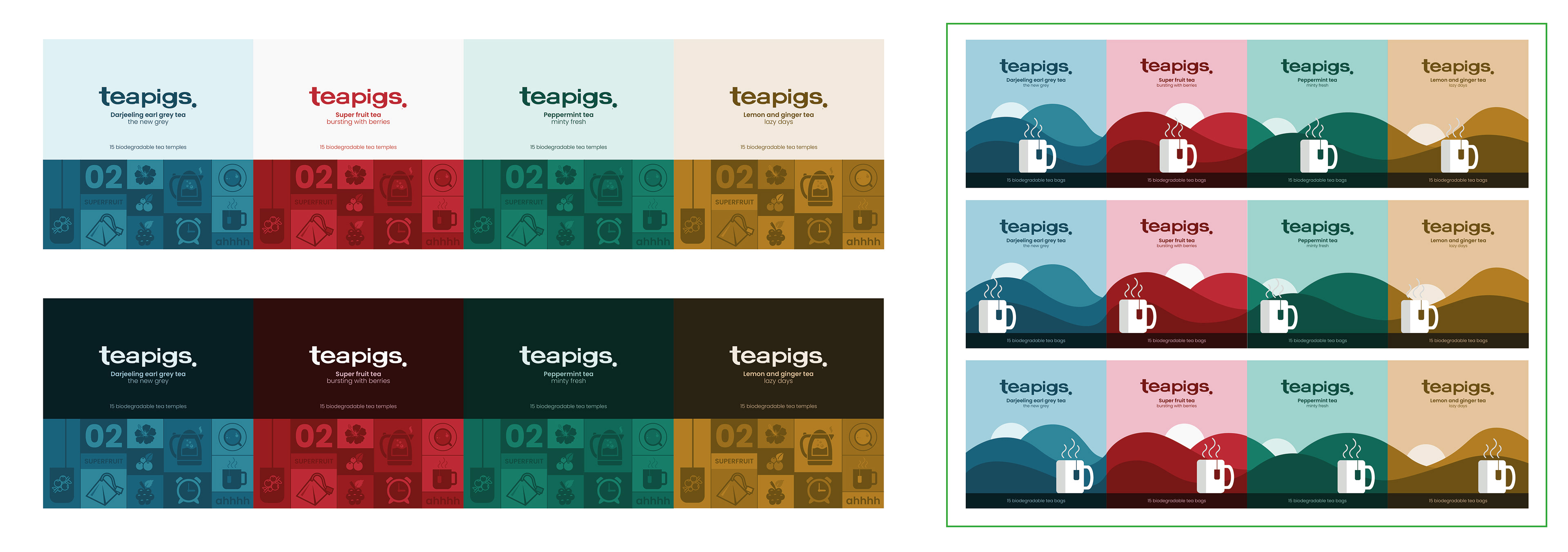
A selection of teapigs' existing packaging design.
Understanding the tea market and competitors
Key to the design process, was establishing and understanding what Teapigs stood for, their values and who their competitors were, both online and in retail, as well as brainstorming ideas of a concept, the rebrand for their packaging could follow. With their current brand lacking in colour, vibrancy and a strong concept, tea designs that focused on these aspects were looked at, specifically with T2 and Brew Tea Co. The designs for these tea companies were particularly useful, due to their minimalist design, yet vibrance in colour. Other competitors used illustration, to help tell a story on each of their designs for a specific flavour, which too was a design route that was particularly appealing, to take Teapigs' redesign down, with the mood boards documented below, brainstorming a series of design routes and concepts, for the redesign of Teapigs' packaging.
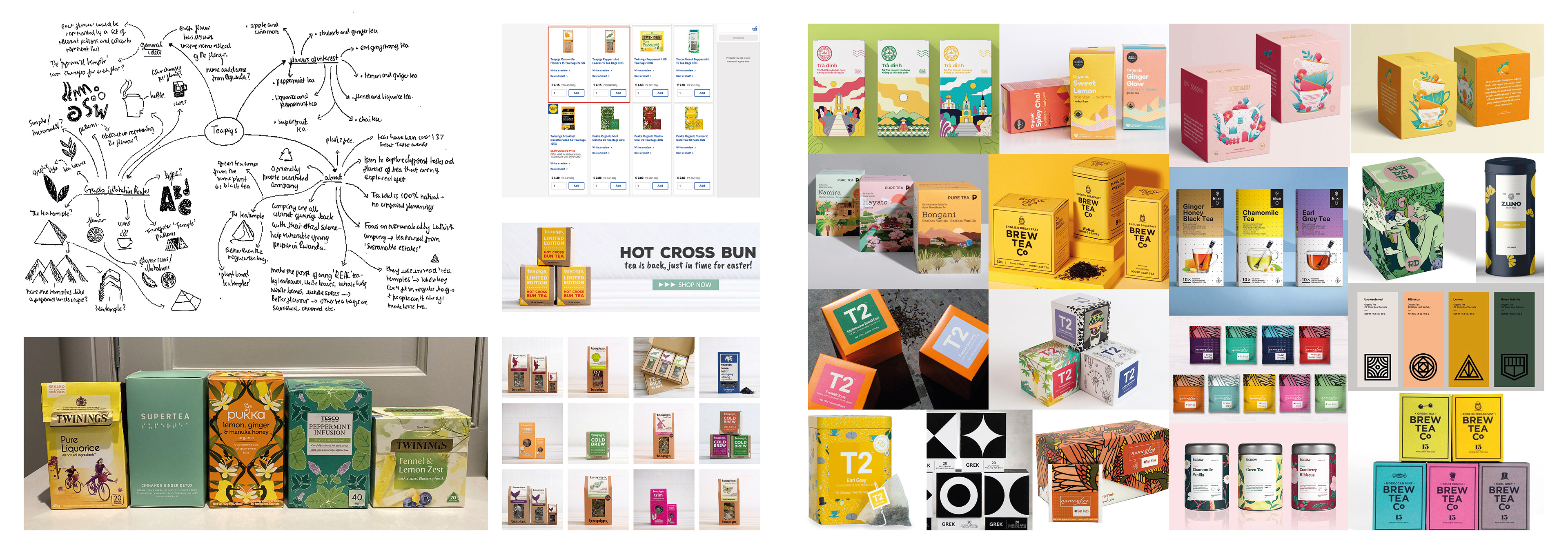
Research board collating images of Teapigs' existing packaging design, retail competitors and designs of interest.
Moodboards exploring themes and concepts, the redesign of Teapigs' packaging could follow.
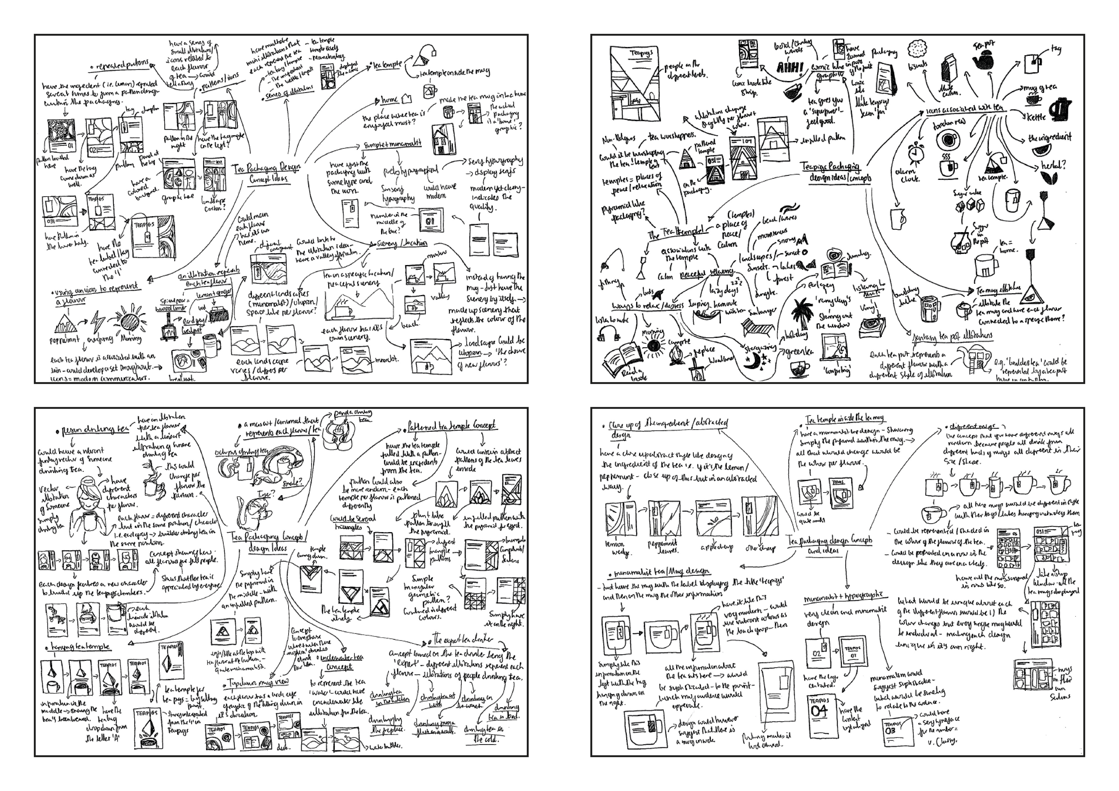
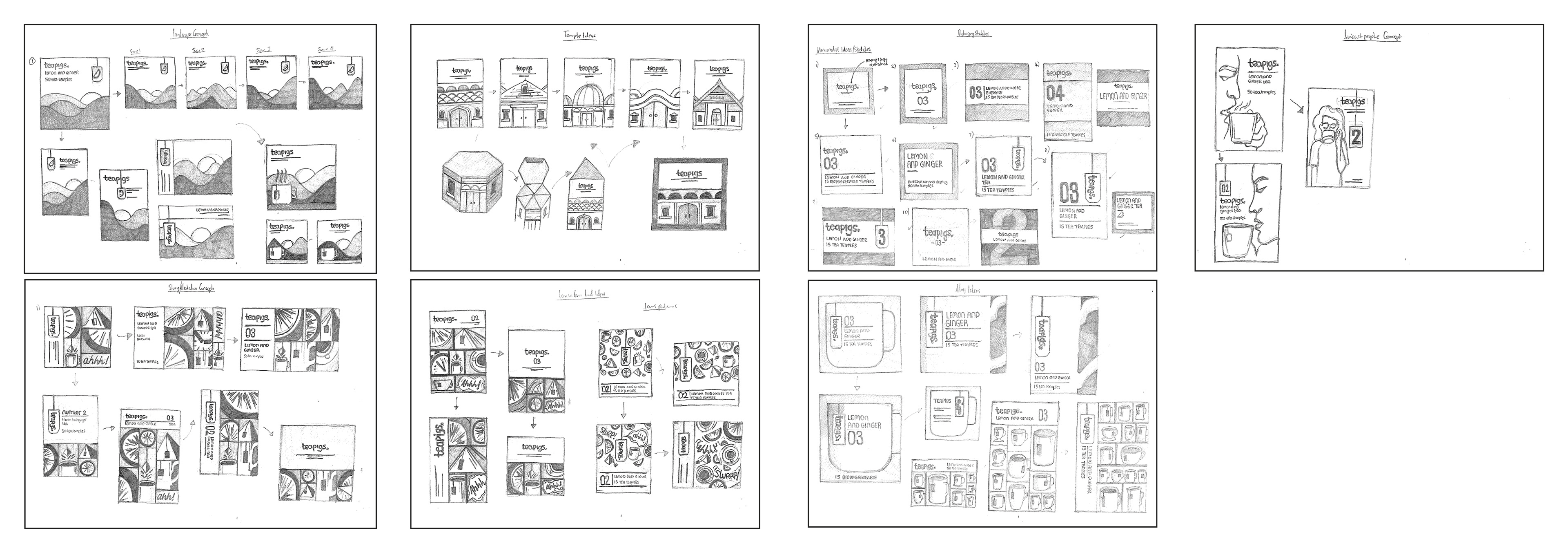
Developing a concept for Teapigs' redesign
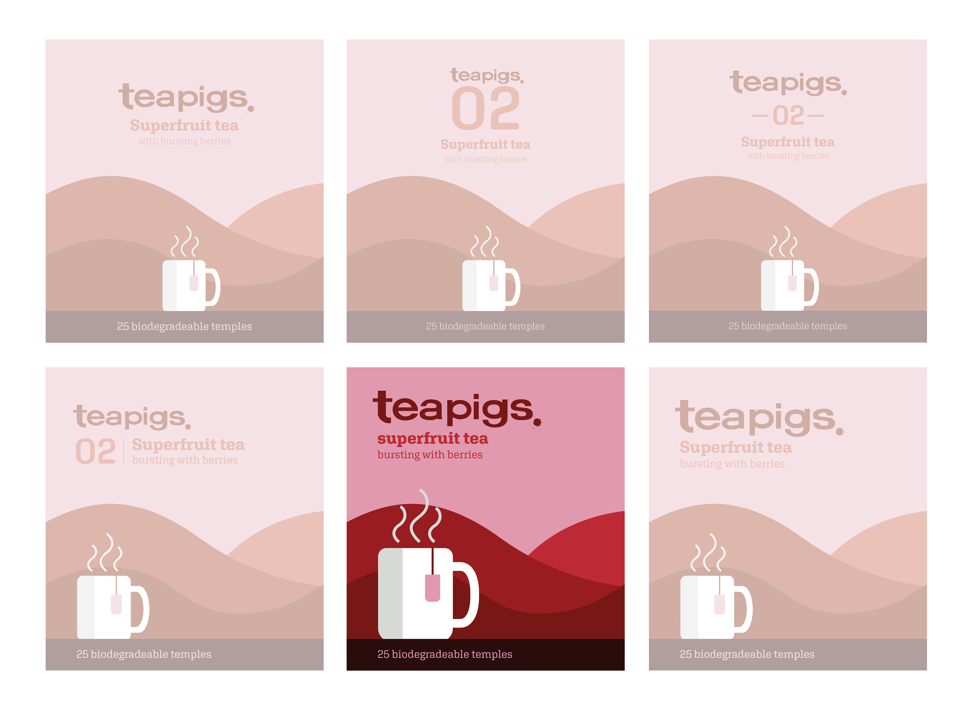
Initial sketches brainstormed a series of viable concepts that could be applied for the redesign of Teapigs' packaging. Some ideas took on a more illustrative approach, whilst others focused on delivering a much more minimalist and clean design. The key focus here, was to ensure the designs explored, were suitably justified as to why they should be used for the redesign of Teapigs' packaging. The chosen design, needed to convey Teapigs in the most compelling way. A series of digital designs comprehensively explore the different options for the redesign of the packaging, with the design process narrowing down into two concepts (as seen in the last image).
A series of initial sketches at a glance, exploring ideas for a theme and concept for the redesign of Teapigs.
Initial digital designs exploring a variety of different design concepts for the redesign of Teapigs.
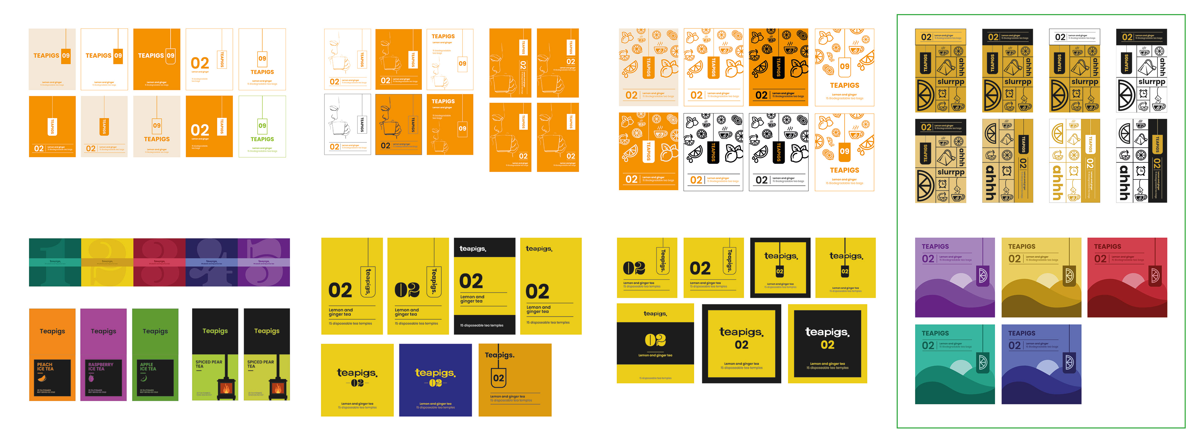
Two digital concepts taken forward, with the designs to the right being favoured for further final refinement.
Refining a chosen theme for Teapigs
The concept that focused on the use of landscapes and the integration of a mug illustration, was the concept chosen for the final development stages. The interlinking of the landscapes, meant the design had a certain advantage with its shelf presence the previous designs were lacking. This was then further explored to refine and work out, what design for the front facing panel worked best in terms of its layout of information and content, within this concept. The mug sitting on a window sill, looking out onto a landscape, evokes calmness and peace which is why the design was fitting particularly for the herbal tea range which was being redesigned.
The chosen front panel design for Teapigs' redesigned packaging.
The final redesign of Teapigs' packaging
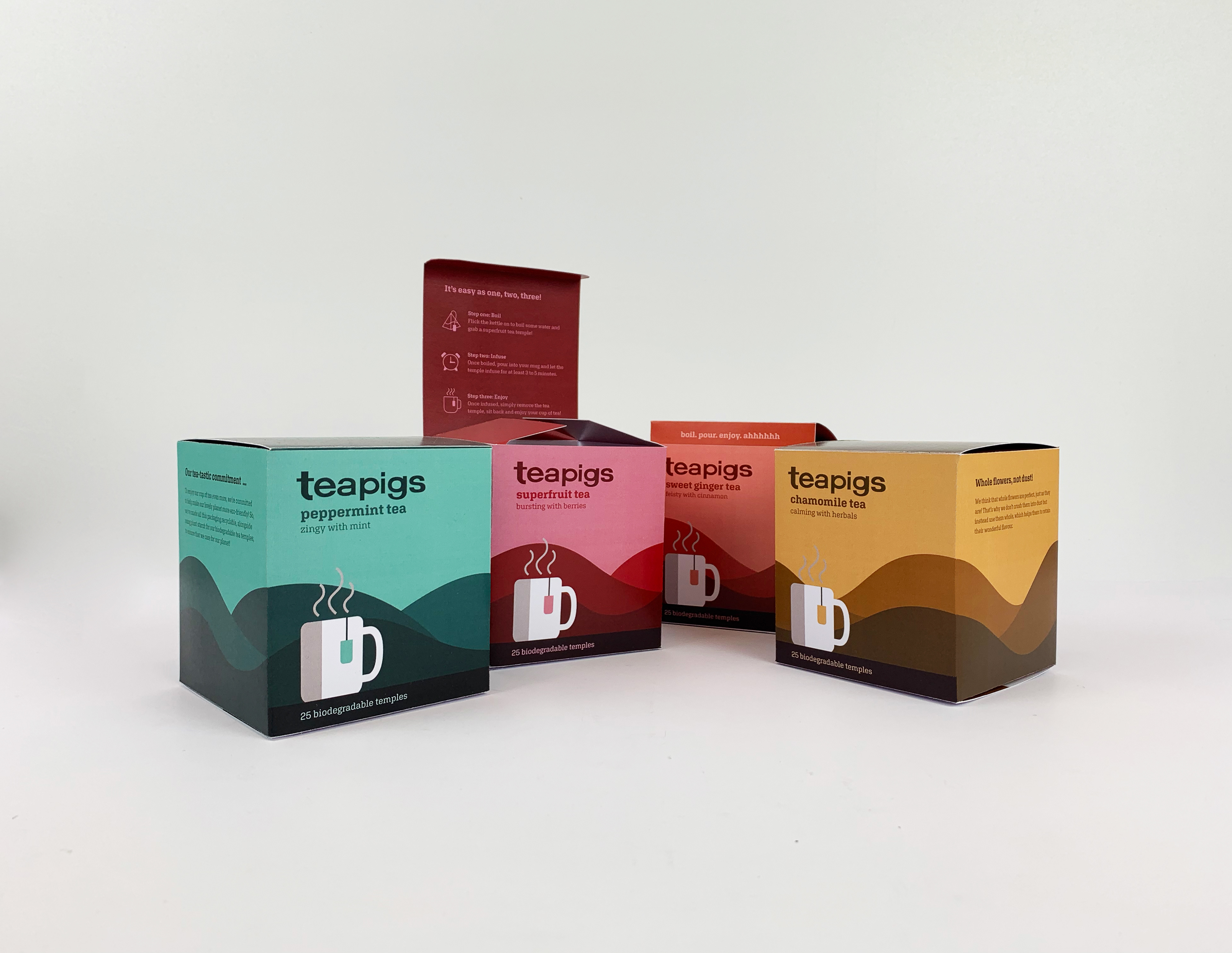
The final design of the packaging, highlights the use of vibrant colour, helping to give the redesign of Teapigs' packaging in general, a much more striking presence on the shelf, in comparison to their original packaging. The interlinking of each of the front facing panels adds to the shelf presence of the design, with each design working collectively and as an individual package too, highlighting the flexibility of the design created. The use of the mug sitting at the bottom, looking out onto a view, conveys feelings of peace and calmness, often associated when drinking a cup of tea. Whilst simple in its form, the left aligned mug used throughout all the designs, could become a symbol for Teapigs, that would allow people to identify the brand by. Additional touches, such as messaging on the tabs as well as instructions located on the underside of the lid, were incorporated into the final design, to make the design of the packaging one that is more memorable for the user, when opening and navigating through the packaging. Adding these small design touches, highlight the importance of utilising all of the panels within the net both on the outside and on the inside.
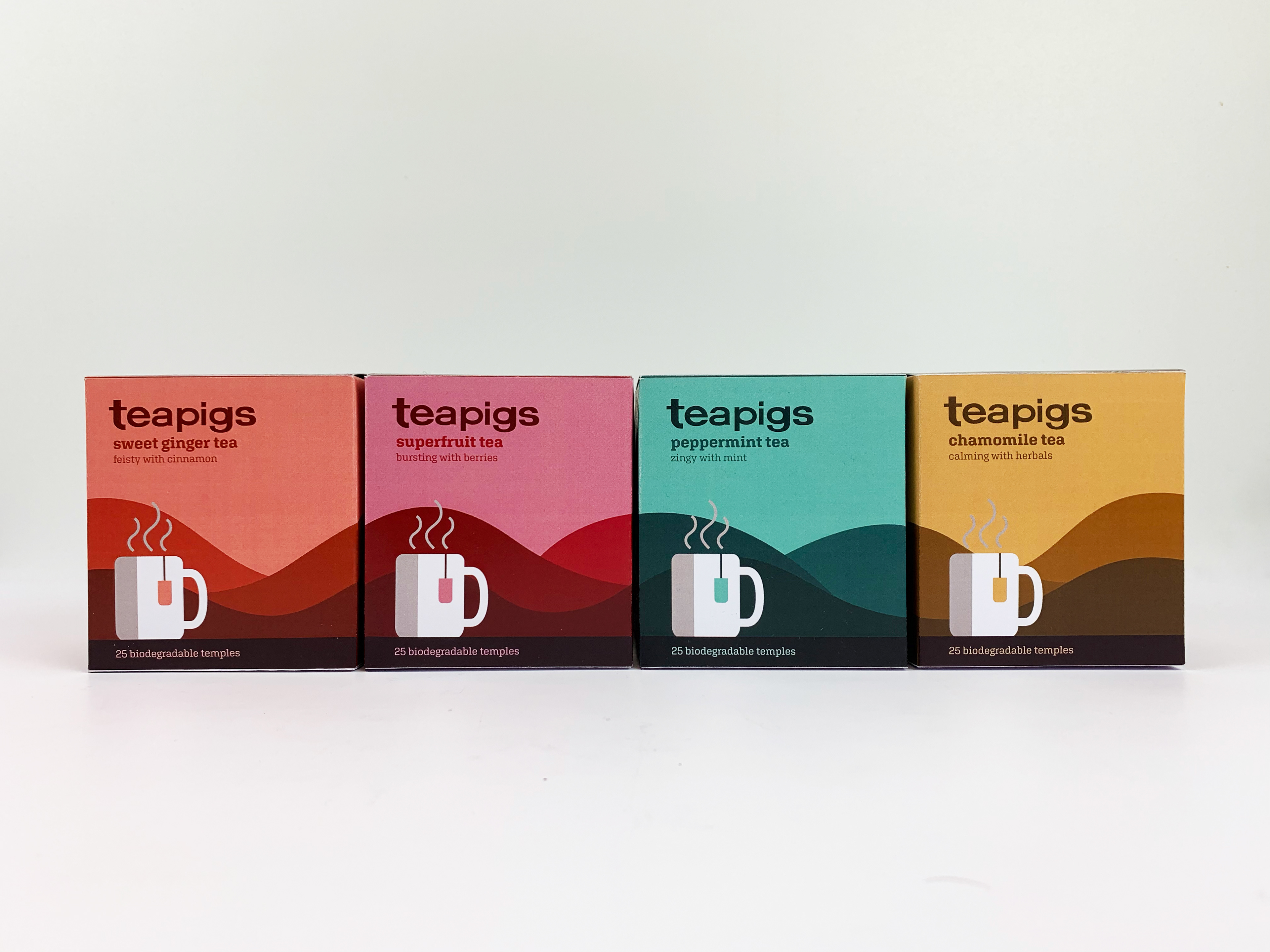
Teapigs' packaging series working as a set together.

Teapigs' packaging series as a set, showcasing information on the underside of the lid.
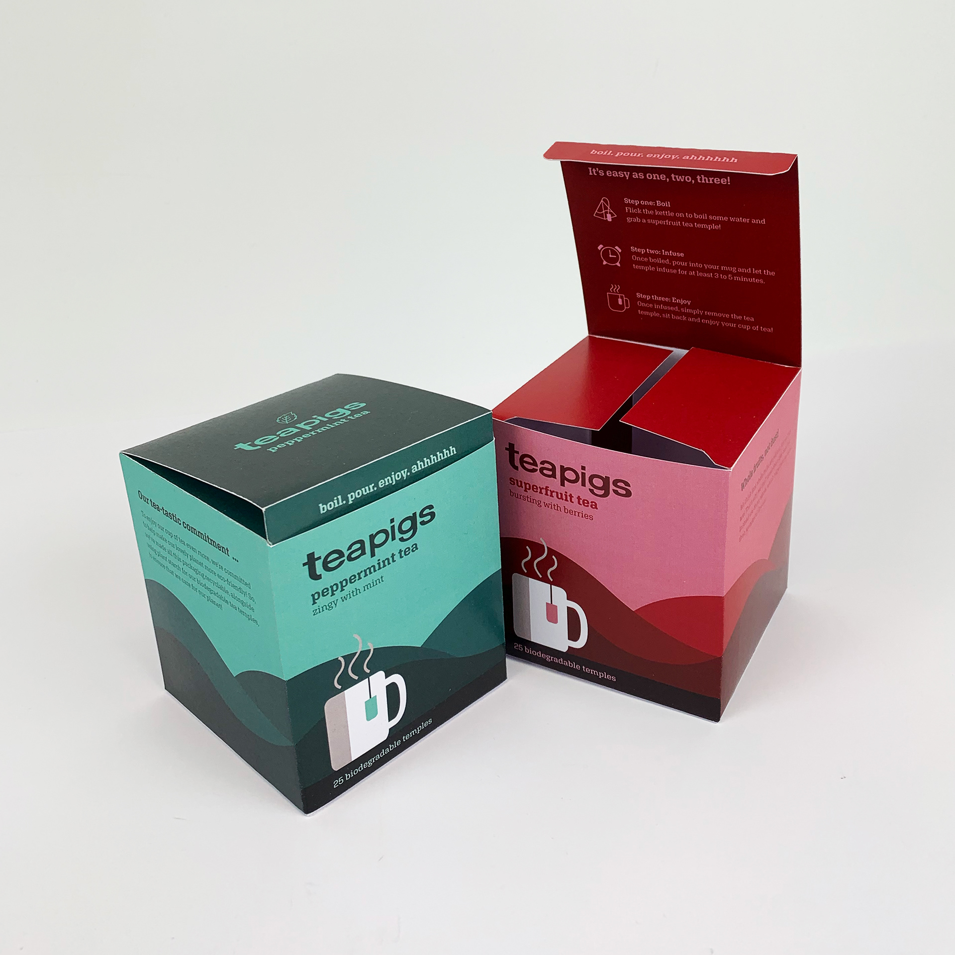
Packaging showcasing messaging on the tab, underside of the lid and the graphic on the top panel.
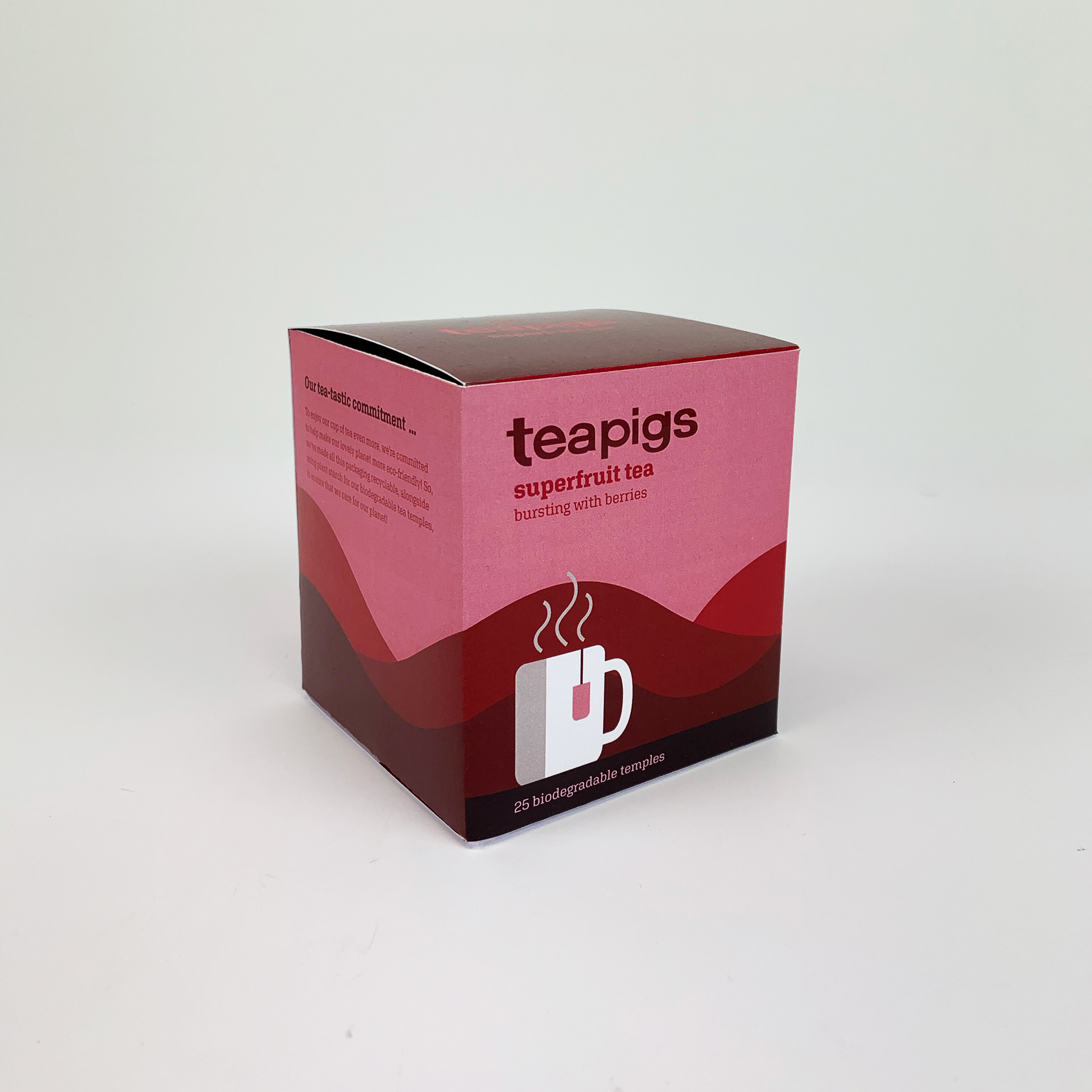
Side on angle of Teapigs' superfruit packaging.
Marketing the redesign of Teapigs
A redesign of Teapigs' existing website was then delivered, showcasing the online presence of Teapigs. A link to the clickable prototype, can be accessed here. Additional items such as mugs and coasters were also used to show off the new redesign of Teapigs. The use of a mug, was applied throughout the additional marketing of Teapigs, with the mug design looking out onto a view being used as a display banner on the website, whilst promotional items such as mugs, made perfect sense, especially as the mug is a focal point of the redesign of Teapigs' packaging.
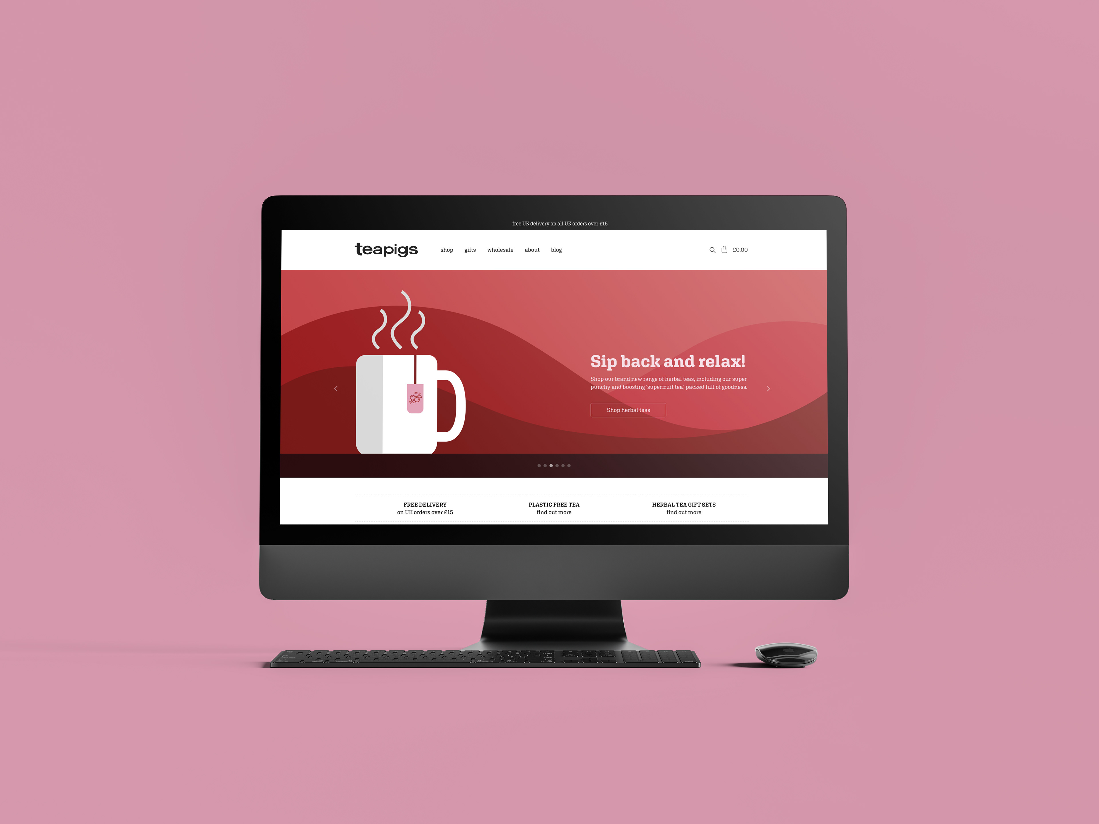
Homepage for Teapigs' website redesign.
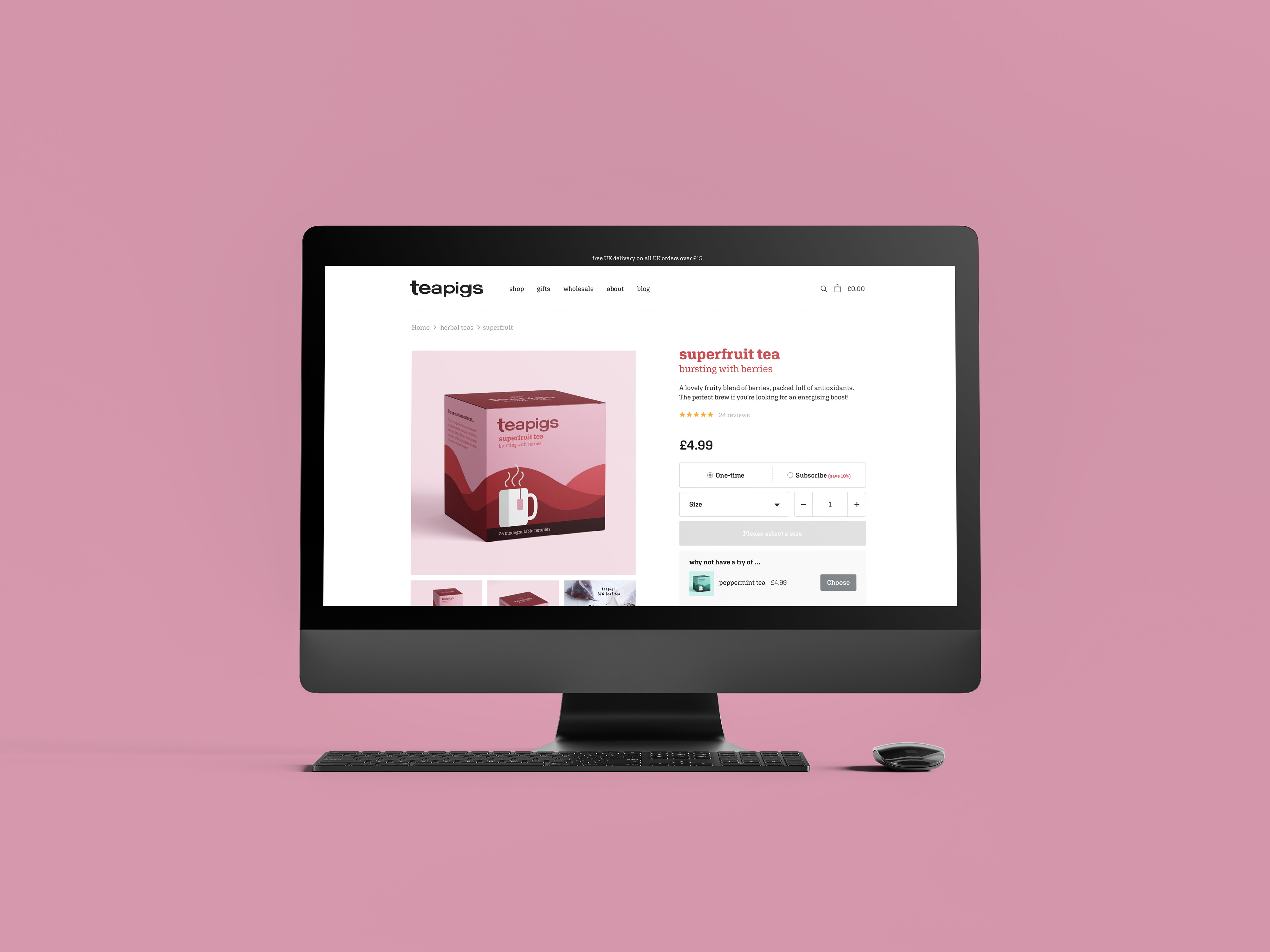
Product page for Teapigs' website redesign.
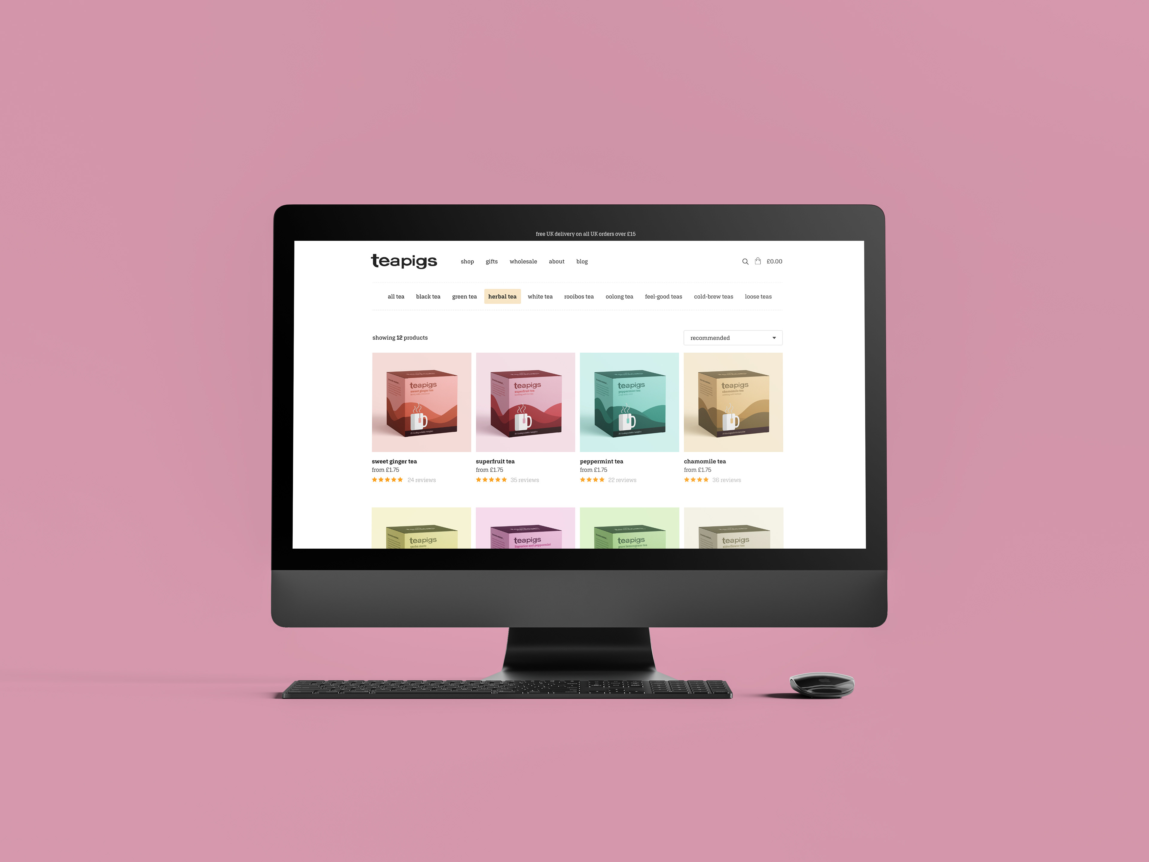
Listings page for Teapigs' website redesign.
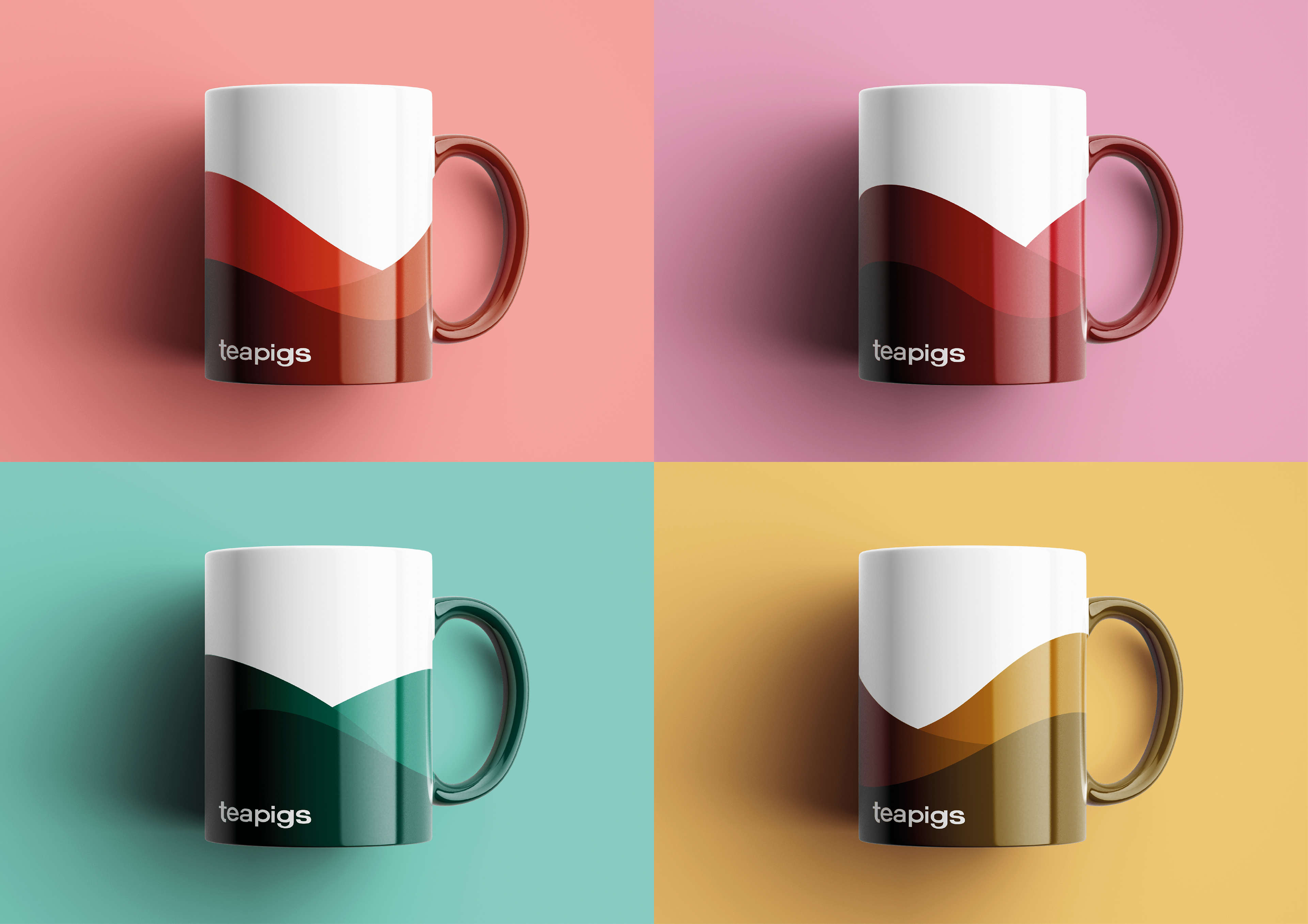
Accompanying promotional mugs as part of Teapigs' redesign.
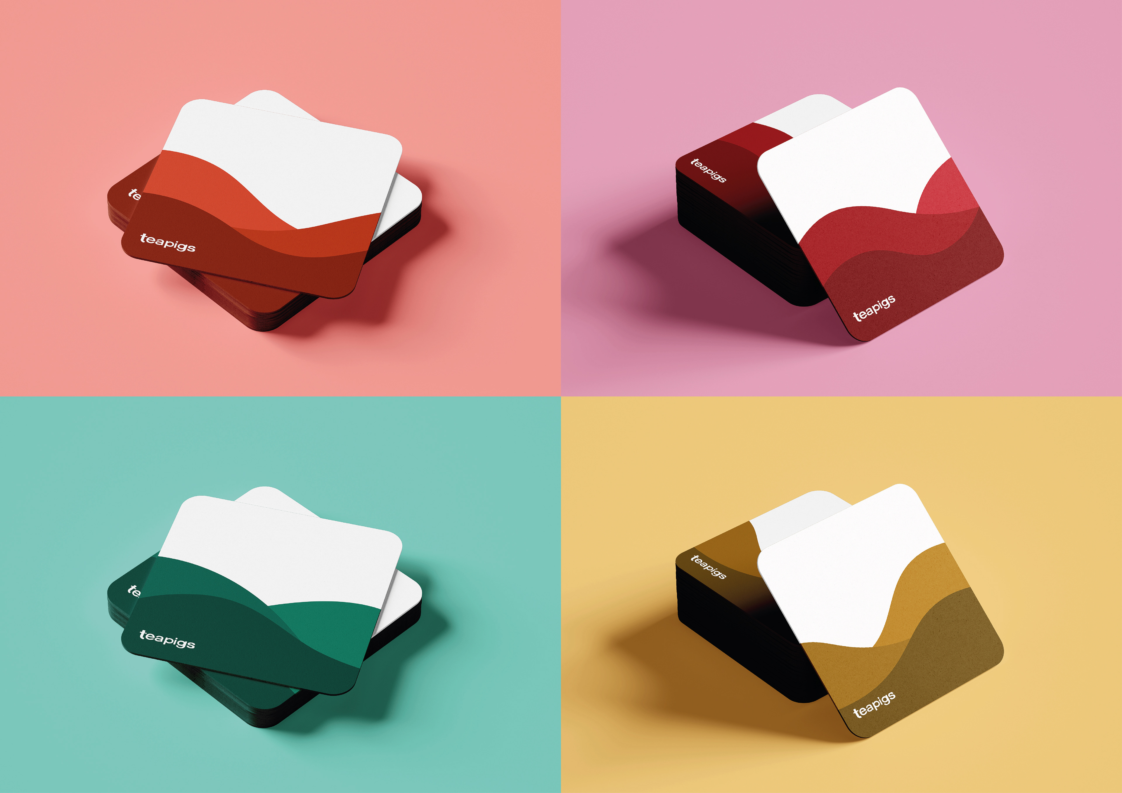
Accompanying promotional coasters as part of Teapigs' redesign.