Routeen is a hypothetical brand developed as part of a third year independent design project, which focused on developing a brand identity and series of packaging and label designs for the gender neutral skincare market, with the aim of developing a credible solution to bridging the gap that exists within the skincare industry. This project developed a brand name, identity and a series of packaging designs and labels for three product. The designs focused on producing genderless patterns, abstracting the human body, leaving only the head and body. In addition to producing a series of designs for the packaging, a brand and identity needed to be thought of. Routeen is the brand name which was thought of for the project. The target audience of these skincare products, are teenagers aged between 15 to 18 years old and so the name played on the fact that, to ensure healthy skin, a good 'routine' is required. From 'routine' the word can be altered to read 'Routeen' which conveys this message but towards teenagers. Read on to explore how the process evolved in identifying a creative direction for a series of gender neutral skincare products.

Packaging containers and applied labels for Routeen.
Identifying a name for a gender neutral brand
The first stage of this project consisted of identifying a suitable name for a gender-neutral skincare brand. Analysing exisiting identities in the market helped with the process in understanding what sorts of names seemed to appeal to a gender neutral market. Many of the names remained clear in using human names (except for brands such as Sam Farmer). Once a series of names had been viewed, I began to extensively brainstorm several names which the products could fall under, which can be seen from the image below which showcases this. Some words were thought of, thinking about the themes of inclusivity and inclusion, whilst some others looked at the action one takes when applying specific skincare products. Overall, the best names from the set were taken forward which were: Mysk (abbreviated for 'My Skin', Skweeze, Routeen, One&All and Incluskin.

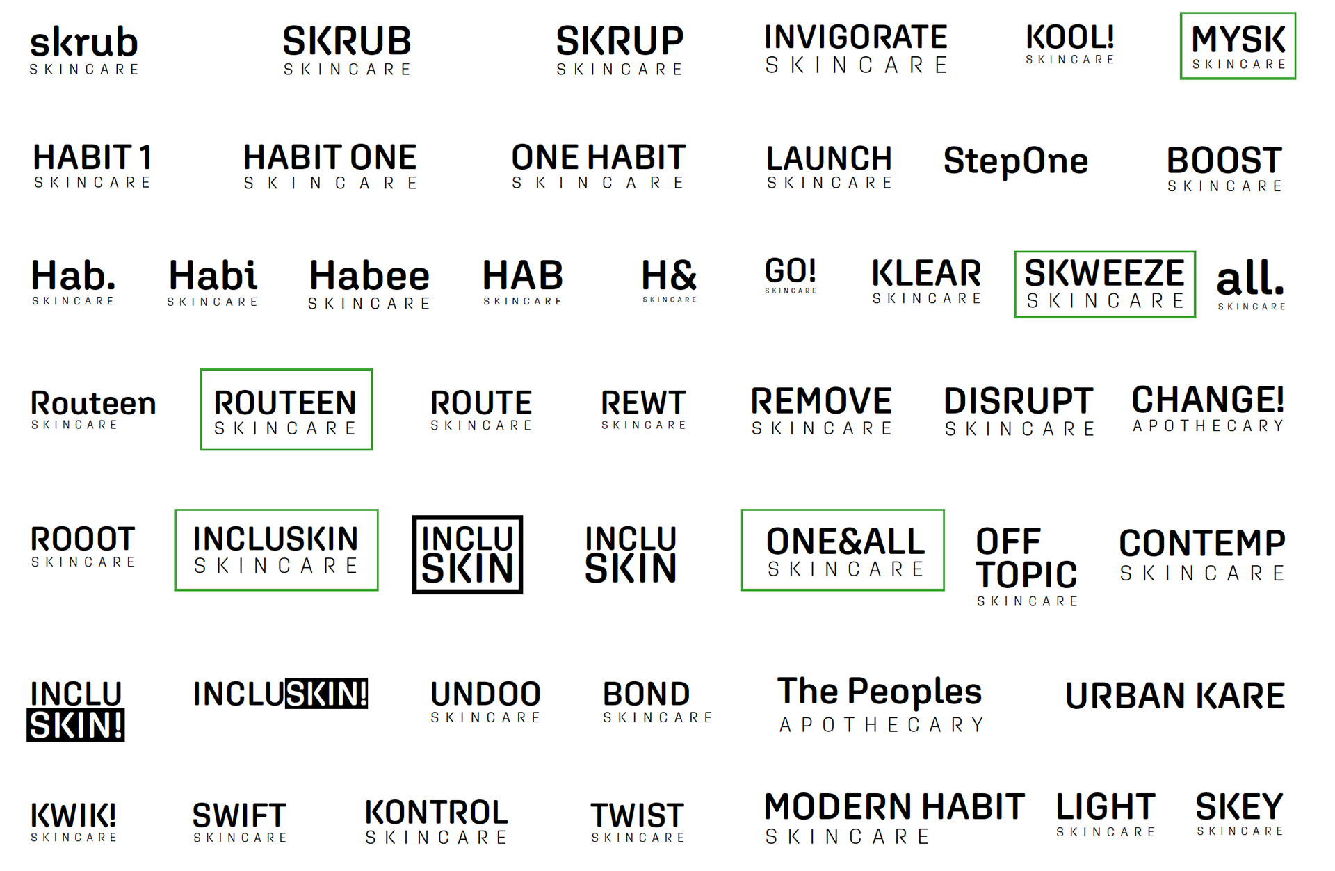
Brainstorm of names for a gender neutral skincare brand.
The search for a gender neutral identity
With the names taken forward, a series of sketches helped to visualise these ideas. It quickly appeared that some of the names did not have too much attractiveness to them such as 'Skweeze'. However the other three were all viable options for an identity. When progressing into digital development for these identities, one of the main symbols incorporated into the logo ideas, was the use of a leaf. One of the biggest selling points for many skincare brands today, is being green. Therefore, this was something that I believe in todays age, was important to incorporate. Therefore many designs explored the use of the leaf in their designs. Some of the logos retained a fairly minimalist and clean appearance whilst others used typefaces which offered gave off a more playful tone. Overall, three identities as seen for the names 'Incluskin', 'Mysk' and 'Routeen' were taken forward and would be applied across the designs of the packaging to see what worked best. Each design had their own merit and each identity was a viable choice, to take forward.
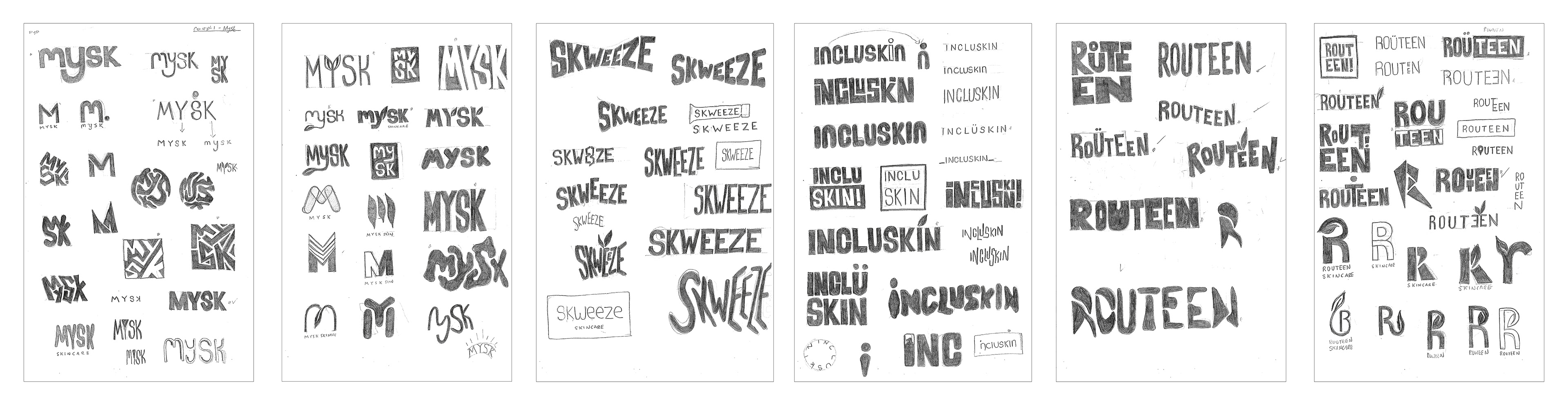
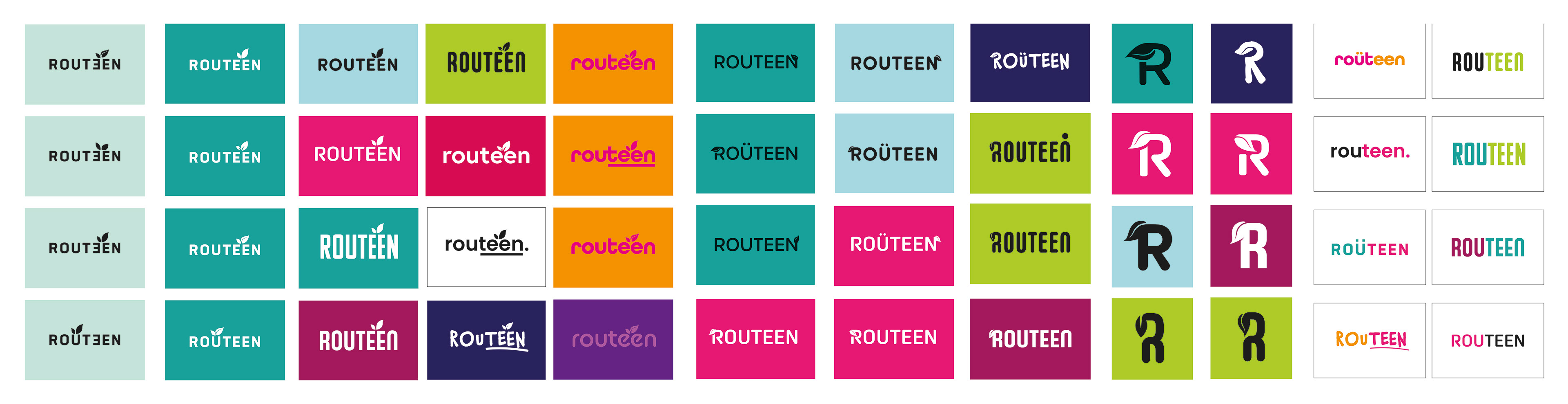

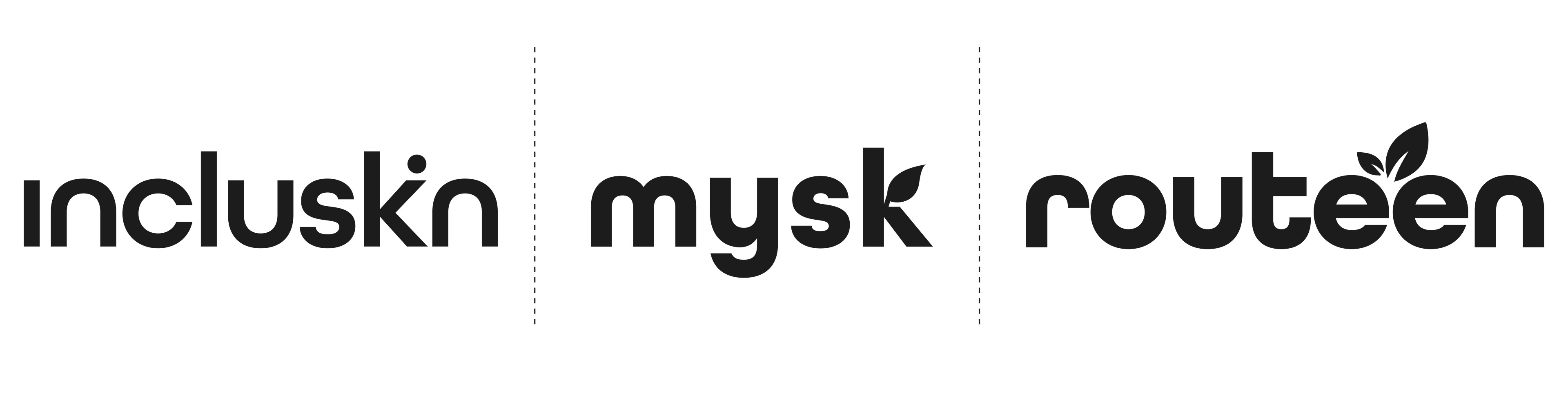
The design process, for a gender neutral identity. Three identities were taken forward, as shown directly above.
Exploring ideas for the design of the packaging
With a series of identities established, a series of designs for the packaging of the gender neutral skincare products, were then explored. Many concepts were sketched out. A challenge was to ensure that the designs did not feel gendered, which some of the designs sketched and digitally produced, did. Many concepts explored the theme of movement and motion, through the use of lines, strokes and patterns which came across as being relatively genderless. The idea behind these types of designs, were to convey the motion one goes through when applying a cream, washing their face and using a scrub (the three products that would be designed). Another challenge was to also ensure that designs did not become boring, by remaining safe in their design. The concept taken forward, which abstracted the human body into a series of dots with bodies (as highlighted in the last image), removed any association to a particular gender, whilst still incorporating the human, in some form.
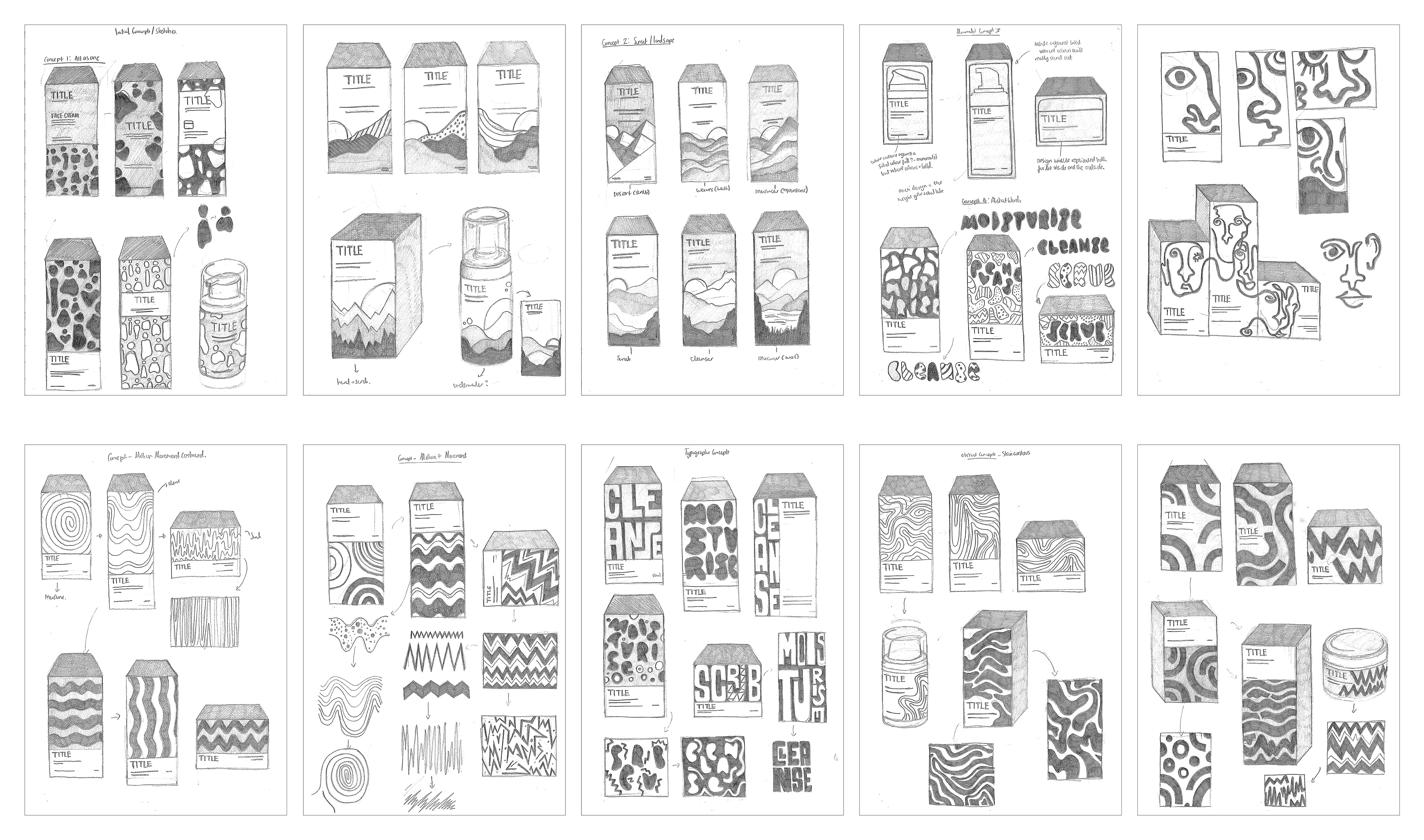
Initial sketches for the design of the packaging.
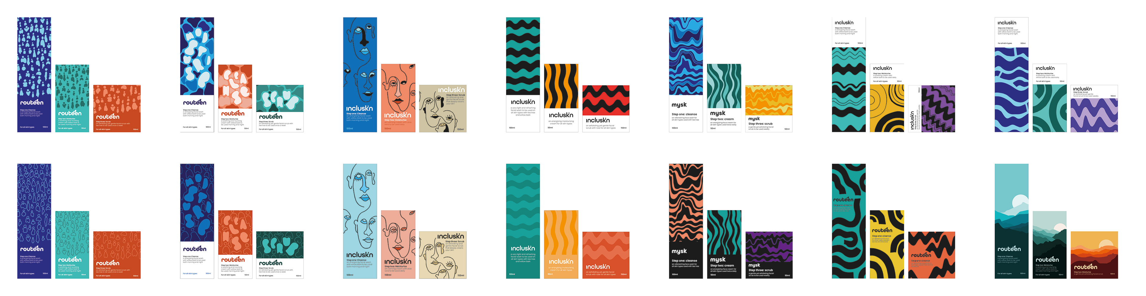
Developed digital designs for the design of the packaging.
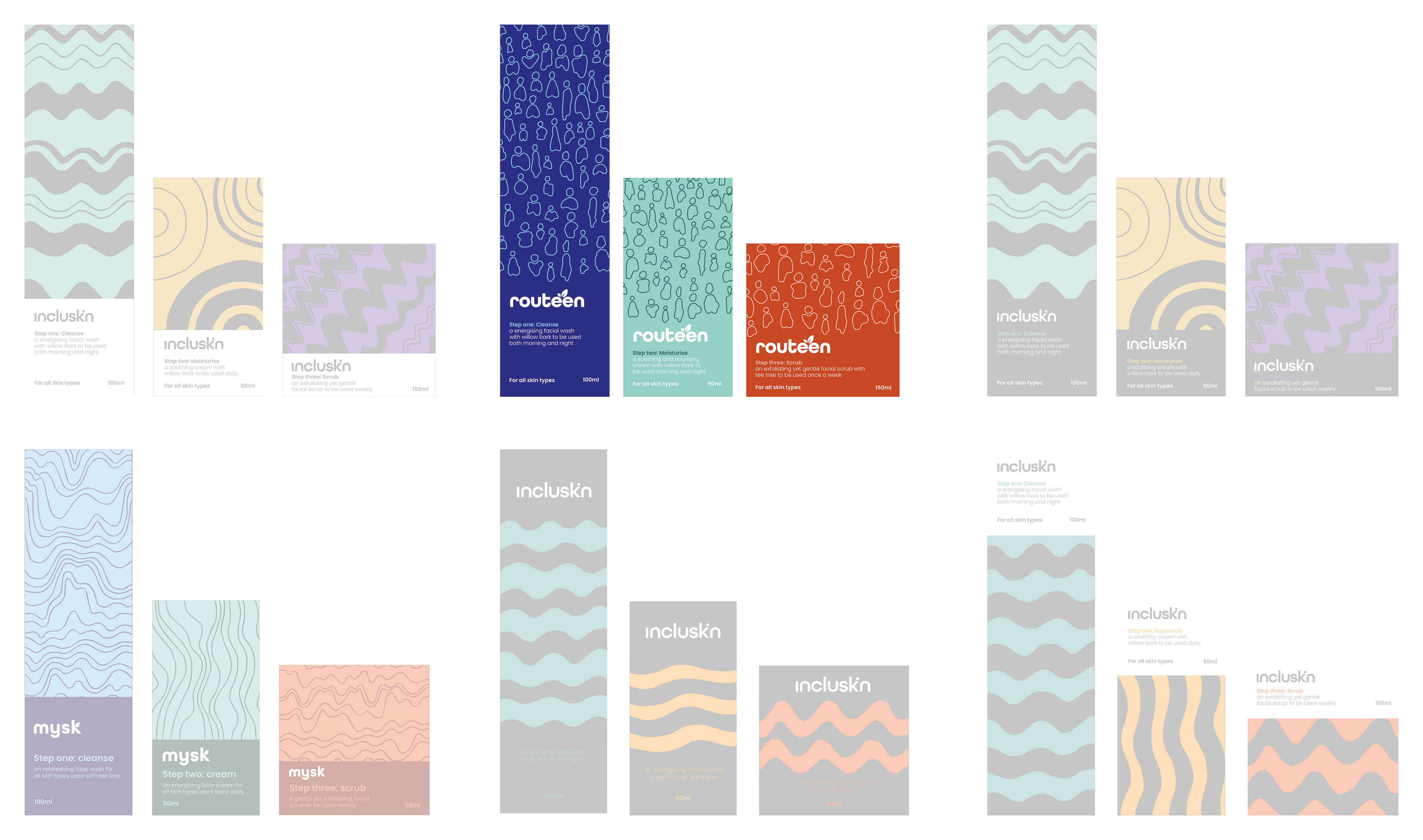
Further development of chosen digital design concepts. The design highlighted above, was taken forward.
The final brand identity: Routeen
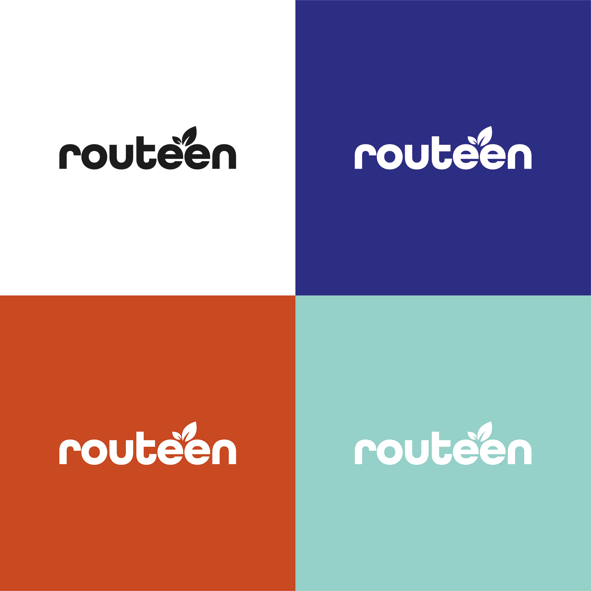
The finalised identity for Routeen, which was selected from the three can be seen from below, sitting against a series of coloured panels, taken from the designs of the three packaging containers. The curvature and roundness of the san-serif gave the logo a friendly appeal, working particularly well for a youthful audience of teenagers. The thickness of the letters, allows the name to stand out well, whilst the addition of the leaf sitting in between both e's, uses white the negative space well, to give the impression that the leaf is sprouting from the ground. The addition of such a symbol, further conveys the theme of being green and sustainable. Overall, the names such as Incluskin and Mysk, felt like they belonged to a slightly older demographic.
The finalised identity for Routeen, against the colours of the three packaging containers.
Application of the identity
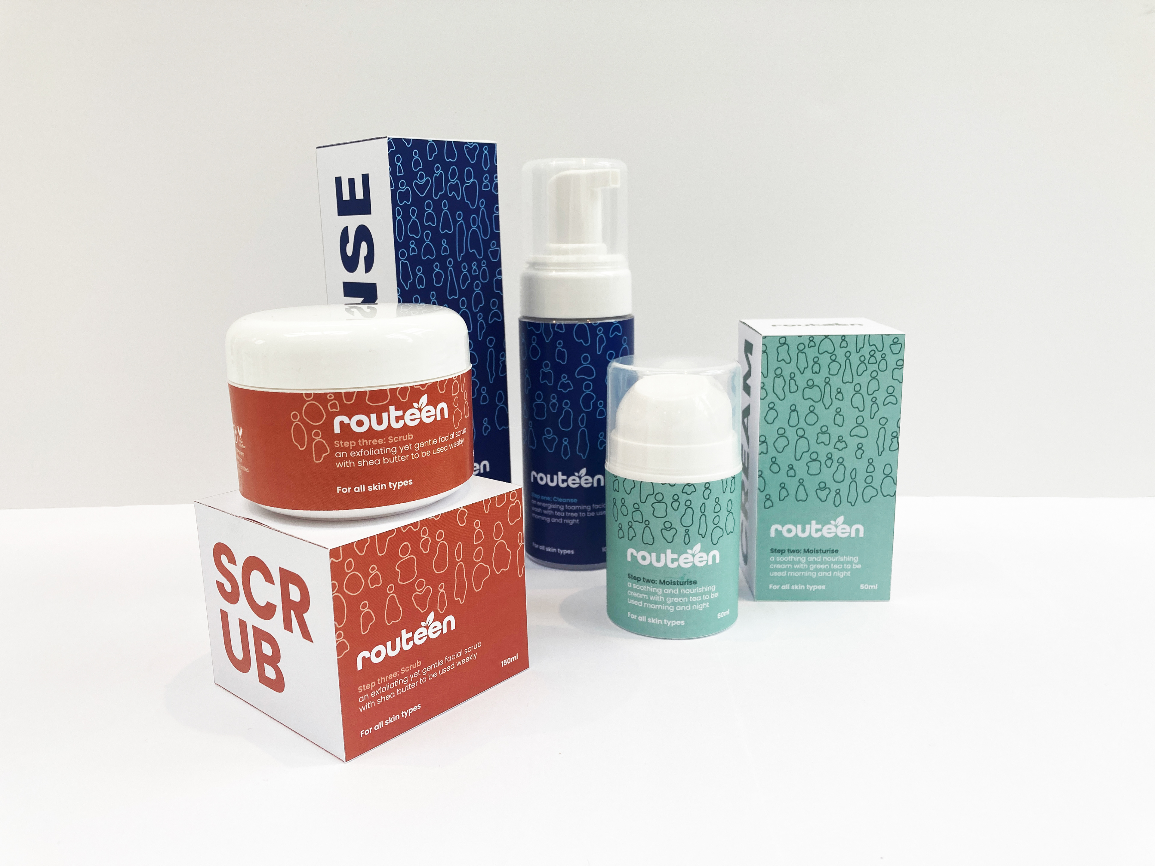
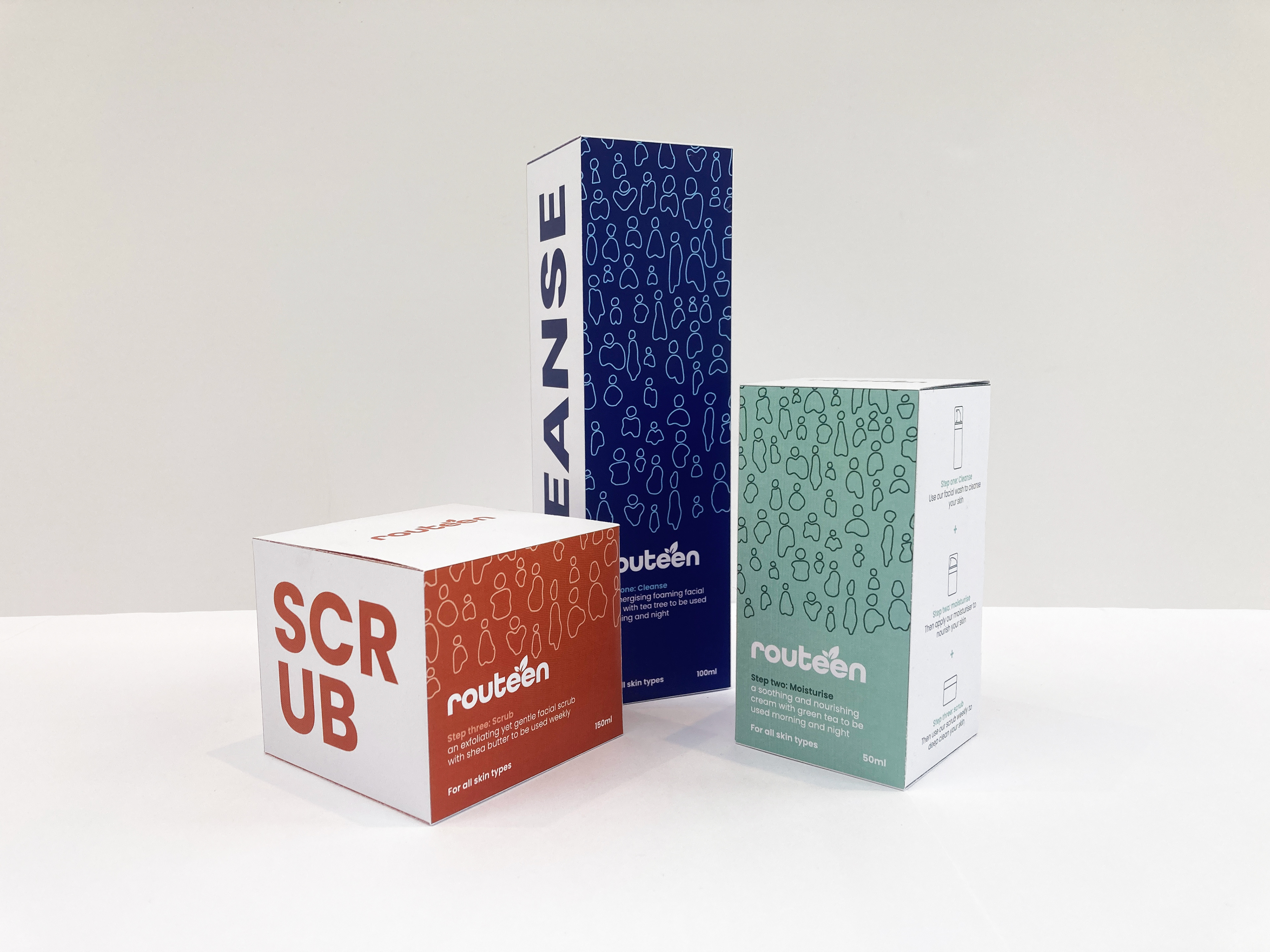
The chosen design for the packaging alongside the identity for Routeen, were then applied across three different packaging containers and also as labels onto three plastic containers. From a functional standpoint, the words 'Cleanse', 'Scrub' and 'Cream', were added to the sides of the packaging panels, allowing potential customers to identify the product from just one side of the packaging, whilst on the reverse, three icons showcase how the three products work with each other. Illustrating the '3-step-process' on a side panel, also helps advertise the other products too. Having completed a series of packaging products, utilising all of the panels within the design is crucial, in being able to maximise the impact of the design itself.
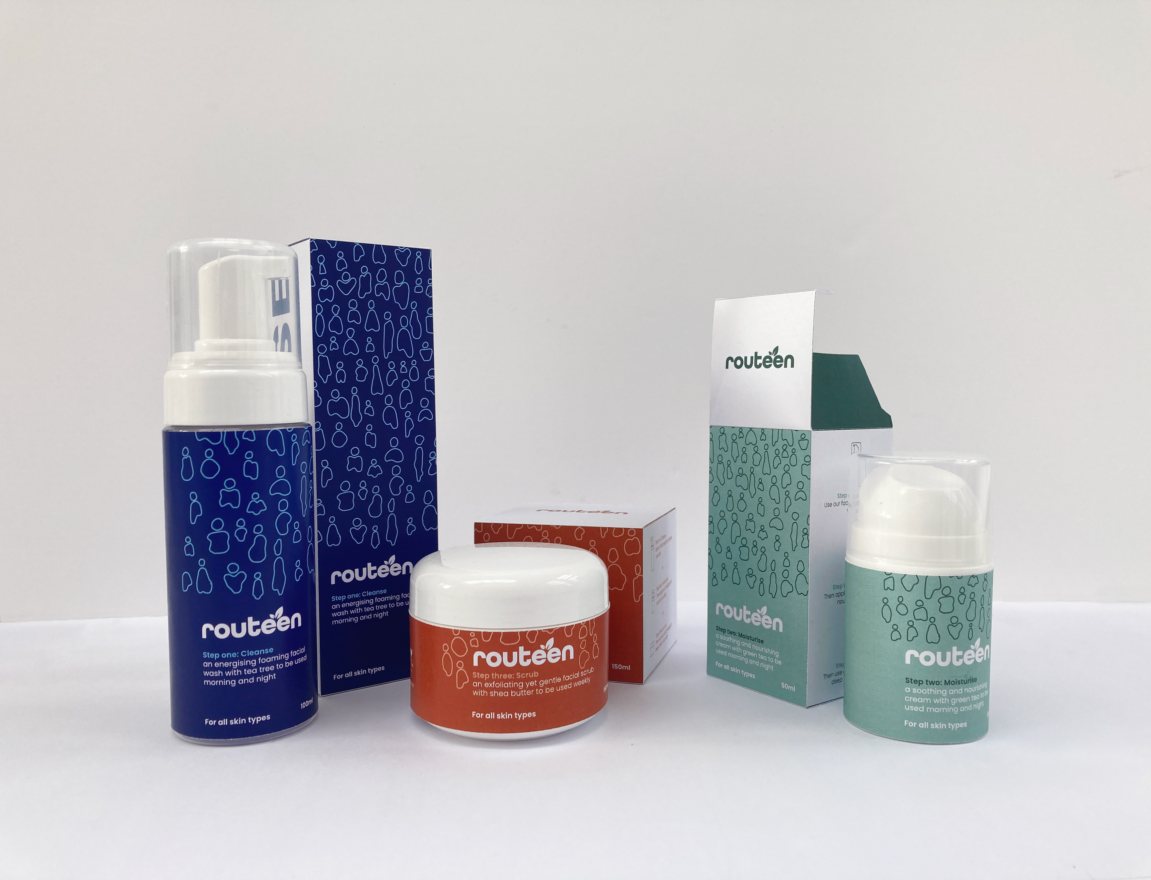
All three packaging containers and labels for the products.
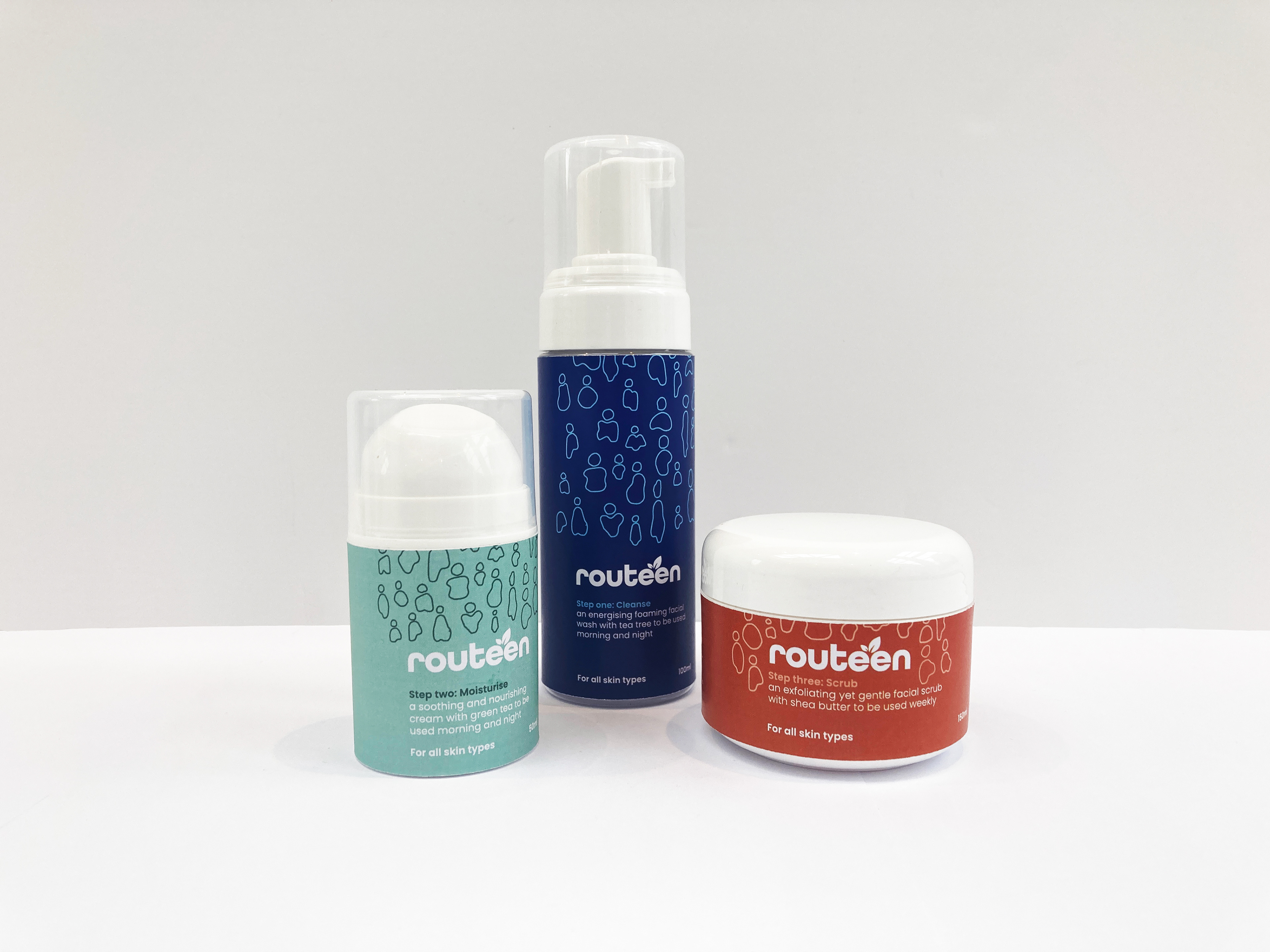
Packaging containers and labels
Packaging containers
Labels wrapped around cosmetic containers.
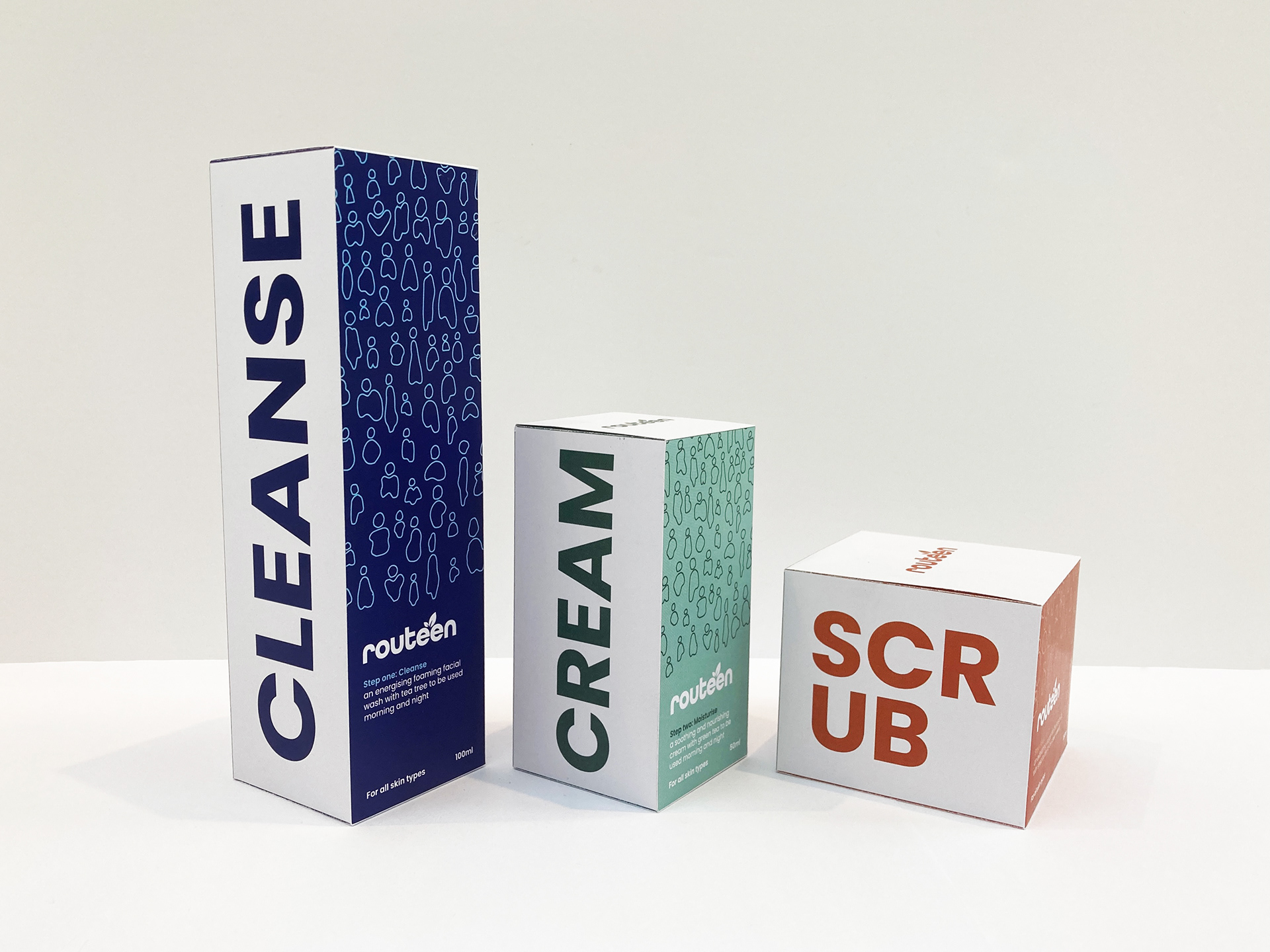
Side view of the packaging containers, displaying the product names.
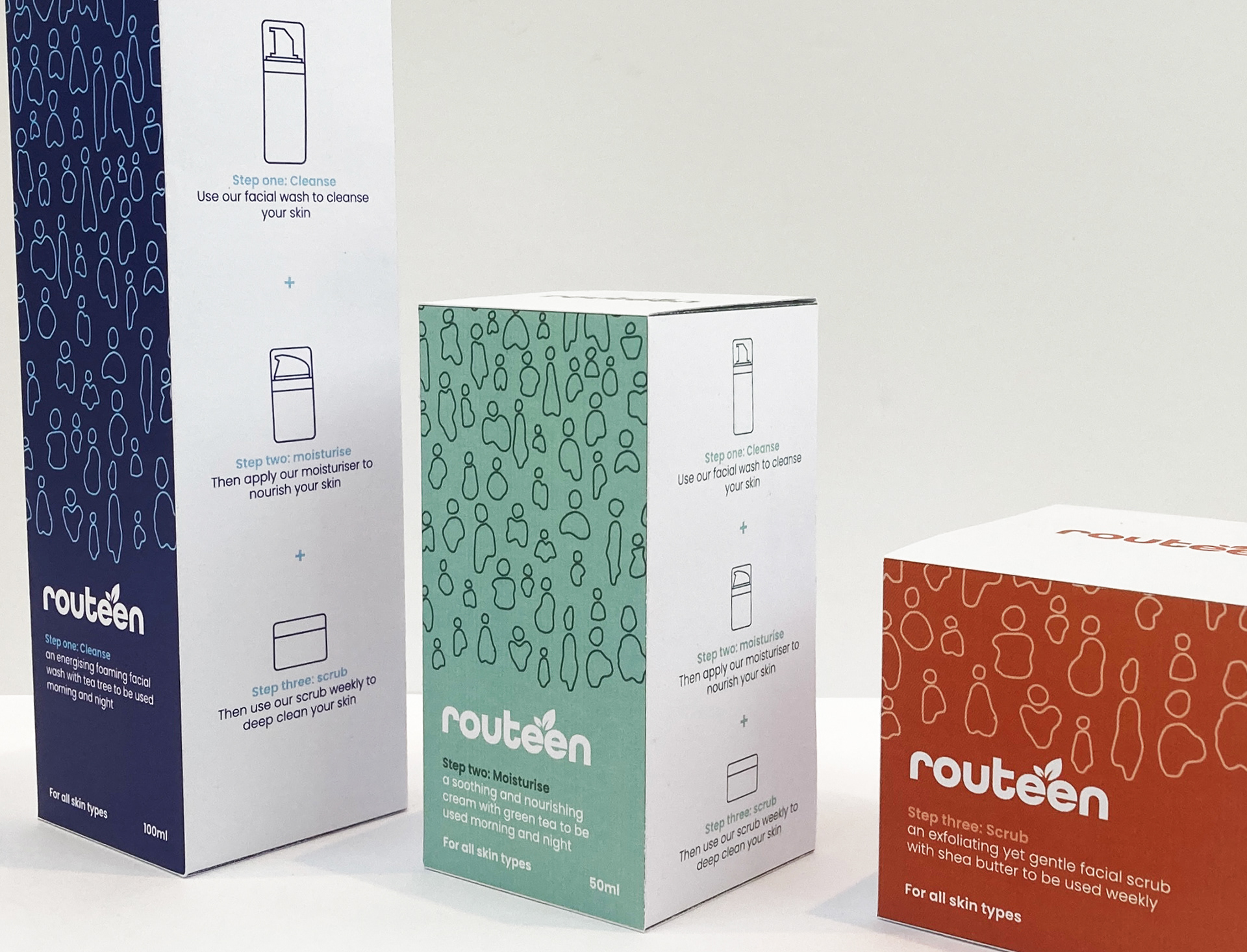
Side view of the packaging containers, displaying the 'three-step-process' of how to use the products as one.