Row Z is an independent football magazine, designed as part of a third year editorial design project. Row Z, explores the visual culture of the beautiful game, often overlooked by general football magazines. Row Z is for those who appreciate football aside from the 90-minute game, exploring aspects such as football shirt typography, fan culture, fashion and more. Crafted by hand through a perfect bind, the magazine measures at 170mm by 230mm, making it a size that is easy to hold, flick through and read. The project required all articles and imagery to be sourced and required the magazine to contain one long article, one short article, an interview in addition to the inclusion of a listings page, to ensure that the design of the magazine could handle all of these different elements successfully, which Row Z manages to do.
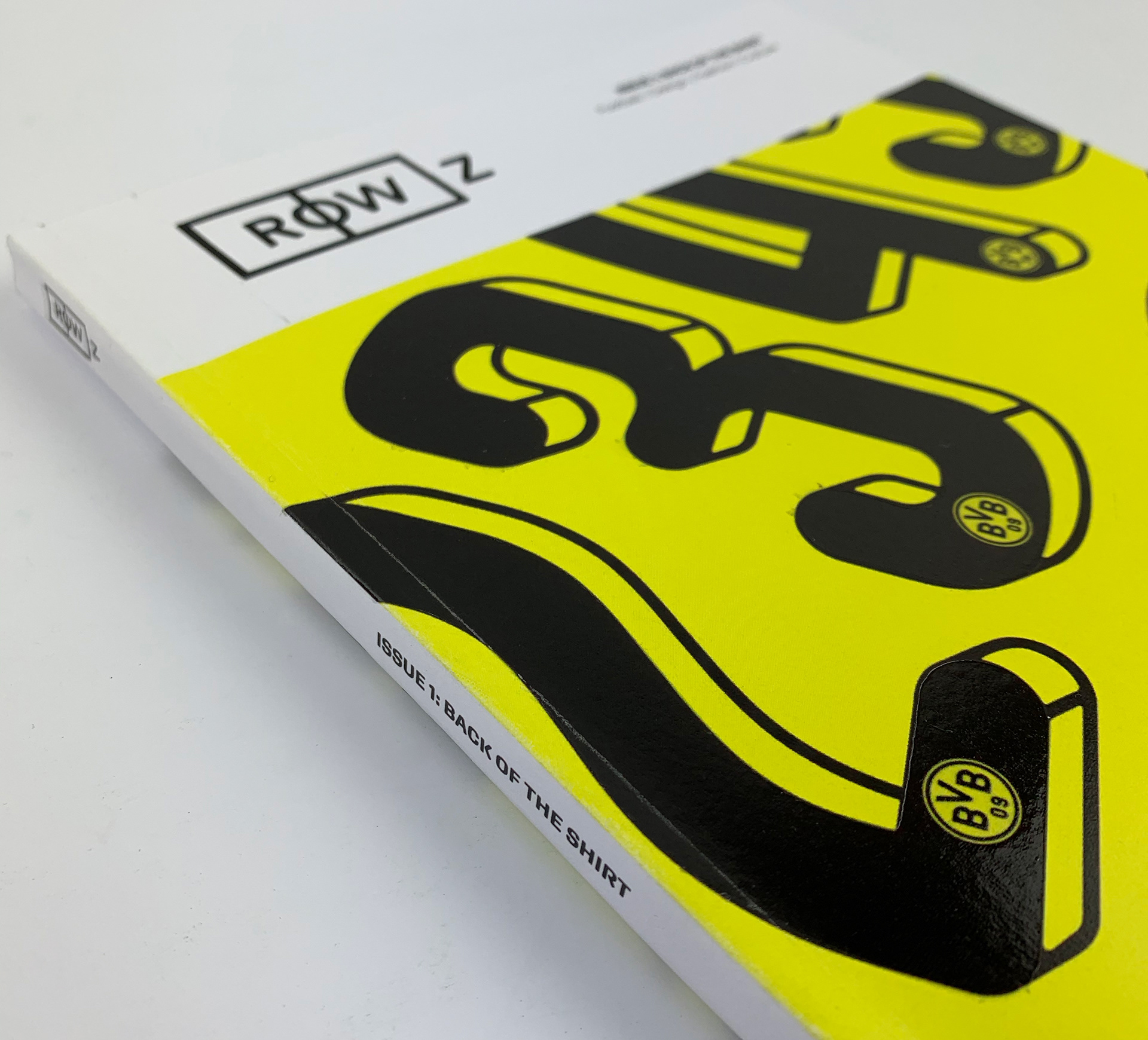
Close up image of the front cover, showcasing the spine on Row Z.
The Row Z masthead
Several names were explored for an independent magazine that would explore the visual culture of football, including names such as Ultras, OneTwo and of course Row Z. Row Z, being the most popular was taken forward as the name for the magazine. The term 'Row Z' in football terms, refers to a football being kicked out of the stadium into the heavens. The name is short and snappy, making it easily memorable. The design of the masthead itself explored several iterations before using the 'O' in the title as a centre circle for a football pitch to enclose around. The fact that the 'Z' in the masthead, sat outside the rectangle, further reiterated the meaning of the football term itself. Whilst relatively restrained and minimal, the bold weight of the typeface and surrounding strokes, provide the masthead with impact.
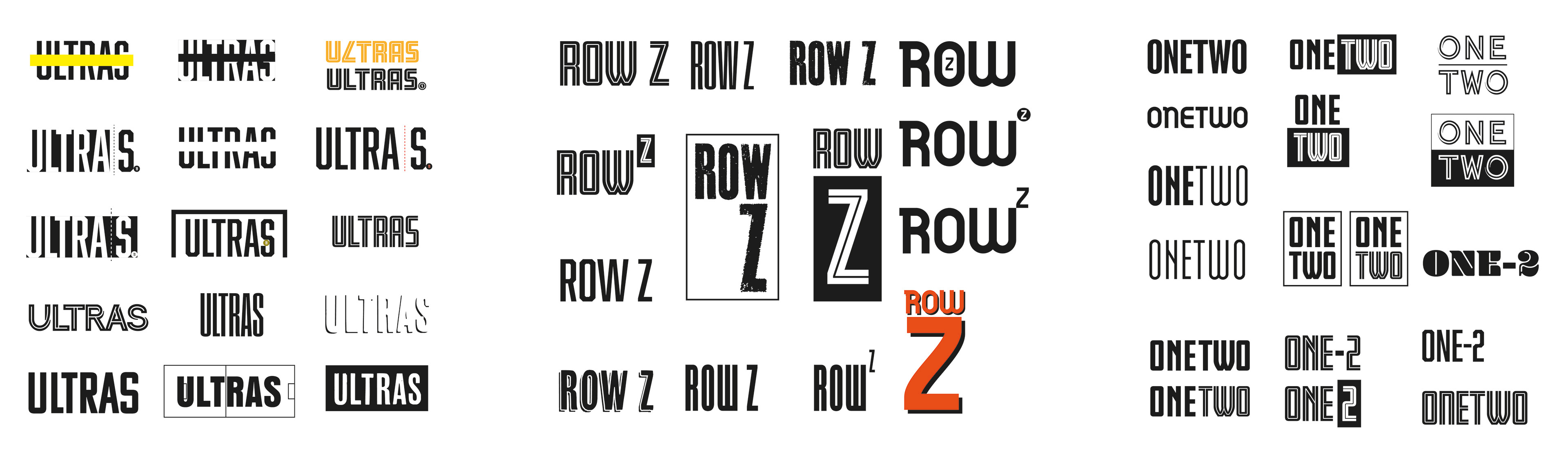
Exploration of name and masthead designs, in the early design phases.
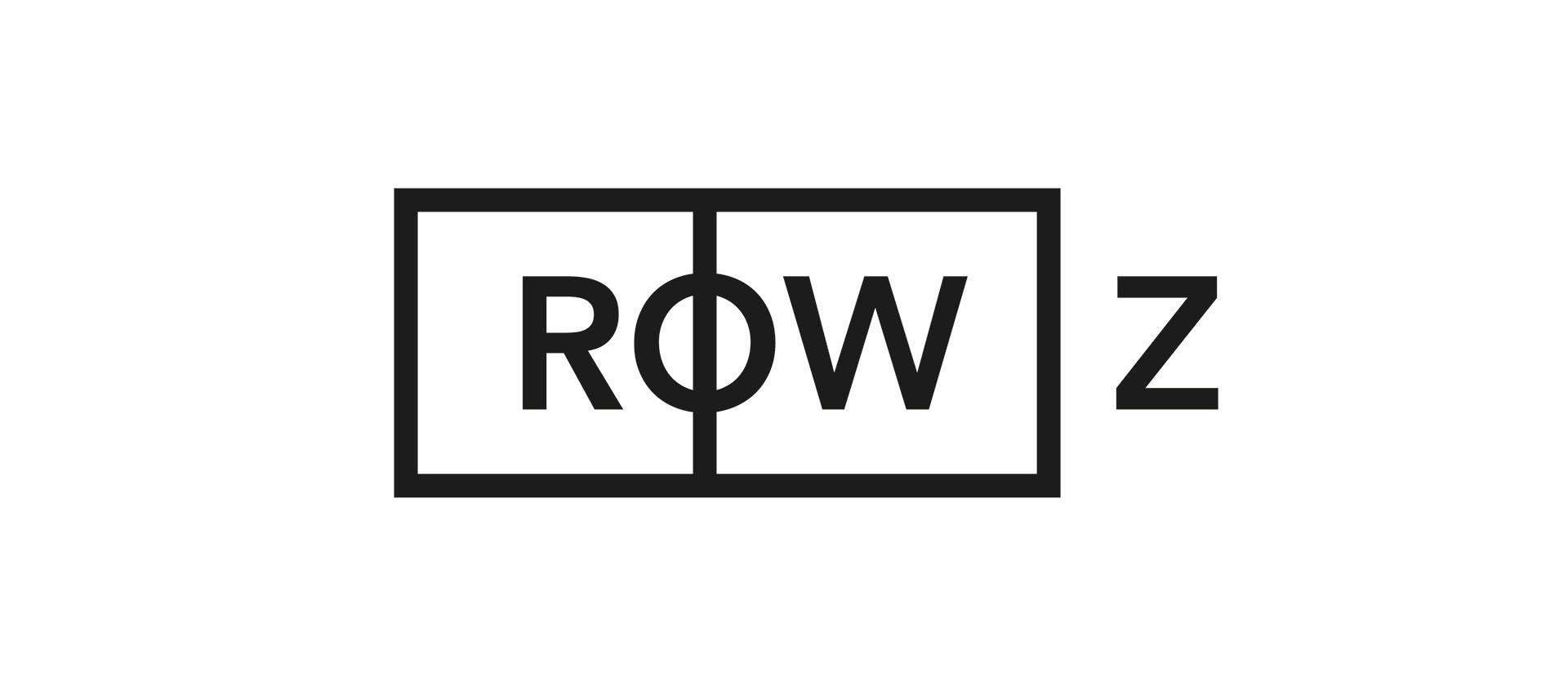
The final Row Z masthead.
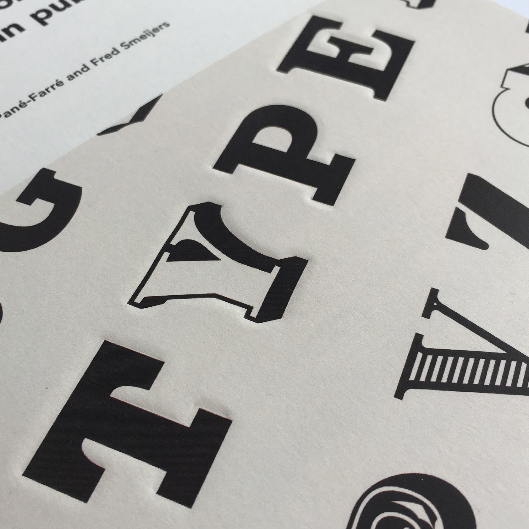
Typography within Row Z
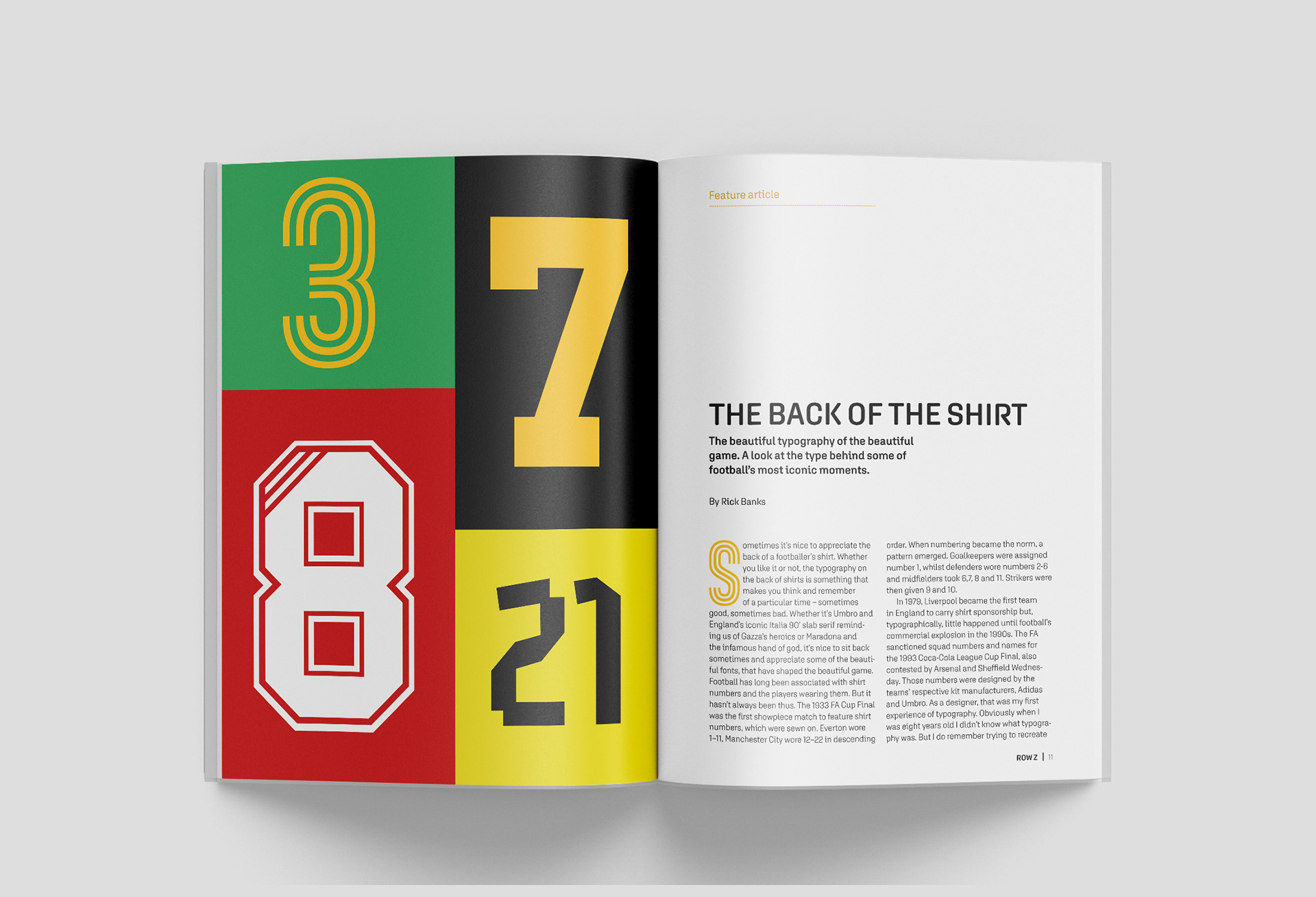
To accompany the masthead, suitable typography that would reflect the look and feel of Row Z's inside pages needed to be considered. Therefore, the typeface Aglet Sans and Gala Triline proved to be ideal for the use of typography within the magazine. Aglet Sans would be applied to all primary body copy throughout the magazine. The typeface came in several weights and remained clearly legible as body text. The intersections and style of the typeform was reminiscent of football shirt typography, highlighting why it was used throughout Row Z. Gala on the other hand, was used as a display typeface throughout. The triline within the typeface, felt reminiscent of 80's football shirt typography, making it a fitting addition into the inside pages of Row Z and providing it with the look and feel it deserves.
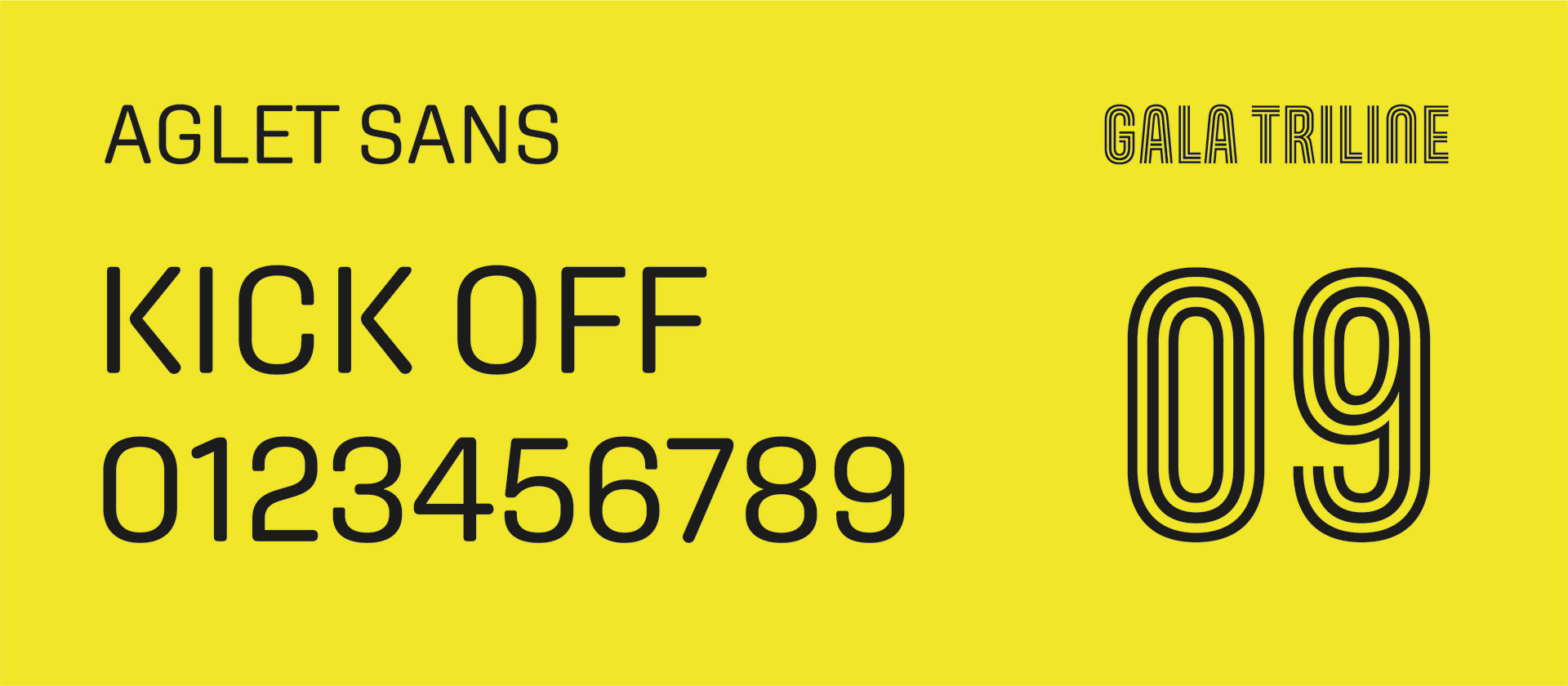
Aglet sans is used for all primary body copy, whilst display features such as drop caps, use Gala Triline, in ROW Z.
The ROW Z cover
Row Z's first issue cover focuses on the back of the football shirt, hence the use of shirt numbers from a particular team. To make the experience of handling Row Z in person, a more memorable one, the masthead is produced from a sheet of vinyl and placed in the top left, to provide a tactile element to the magazine, whilst the use of a spot UV on the numbers, enhances the look and feel of the first issue, making the issue one that is memorable to handle, especially when the light catches on the numbers, allowing the magazine to stand out. Incorporating these finishes to boost the presence of the physical edition of Row Z, would only encourage more people to open the magazine up and read through the pages.
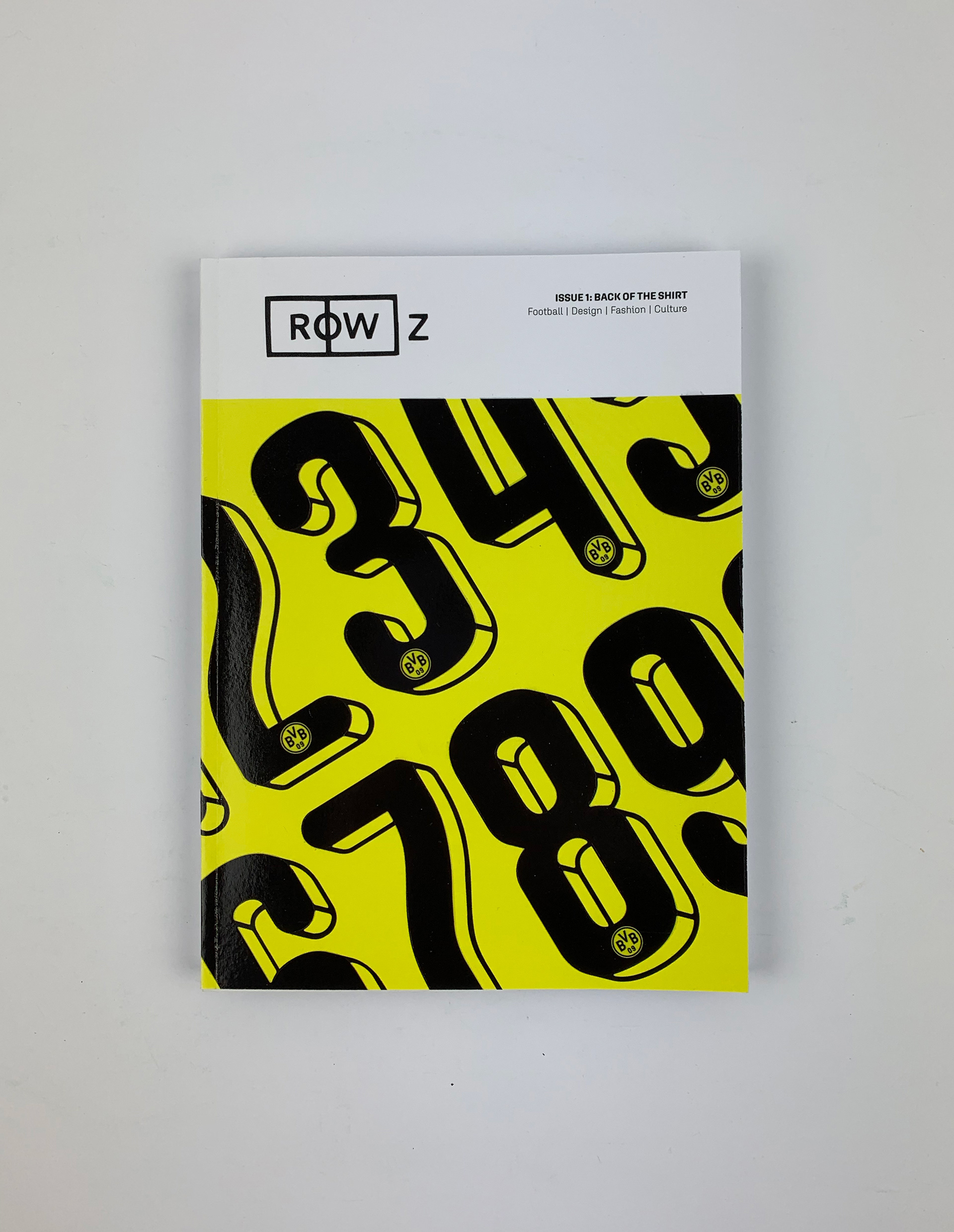
The front cover of Row Z.
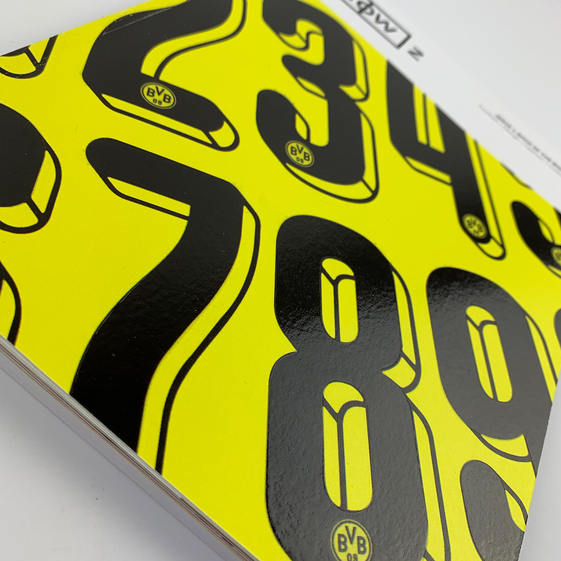
The spot UV finish applied to the black areas of the numbers on the front cover.
Inside of Row Z
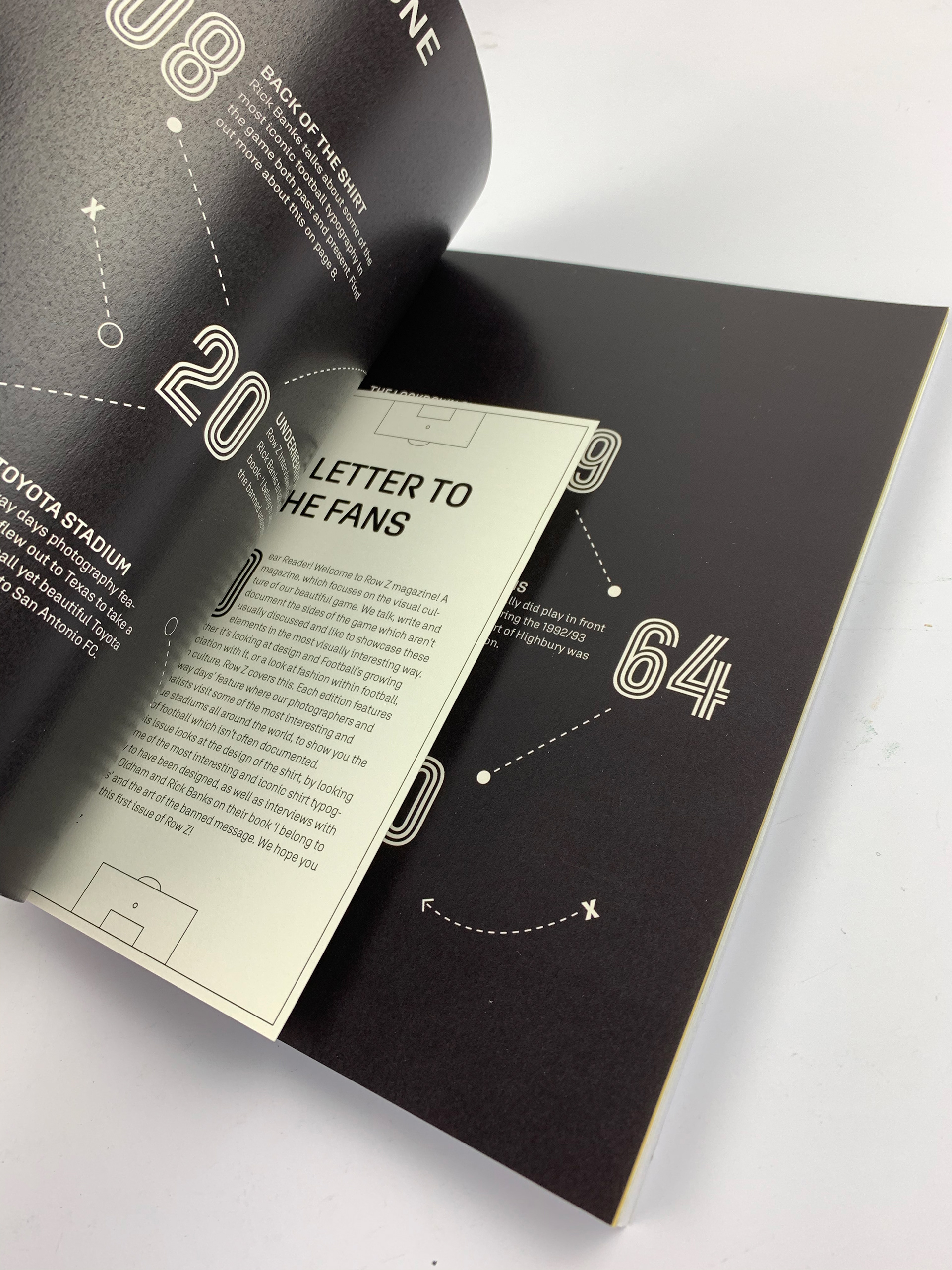
Row Z includes a series of long and short articles, interviews and questionnaires alongside other elements. Whilst the typeface has been mentioned, strong and powerful imagery has been carefully chosen for the inside pages. To retain the football themed look and feel, small additions throughout the issue have been incorporated, such as the use of tactical lines to point the user towards certain information, as showcased in subsequent images of the inside spreads, whilst an editors note in the shape of a football pitch sits tucked inside the contents page. Small additions like these, make the experience of flicking through Row Z, one that is memorable and sure to encourage more to read.
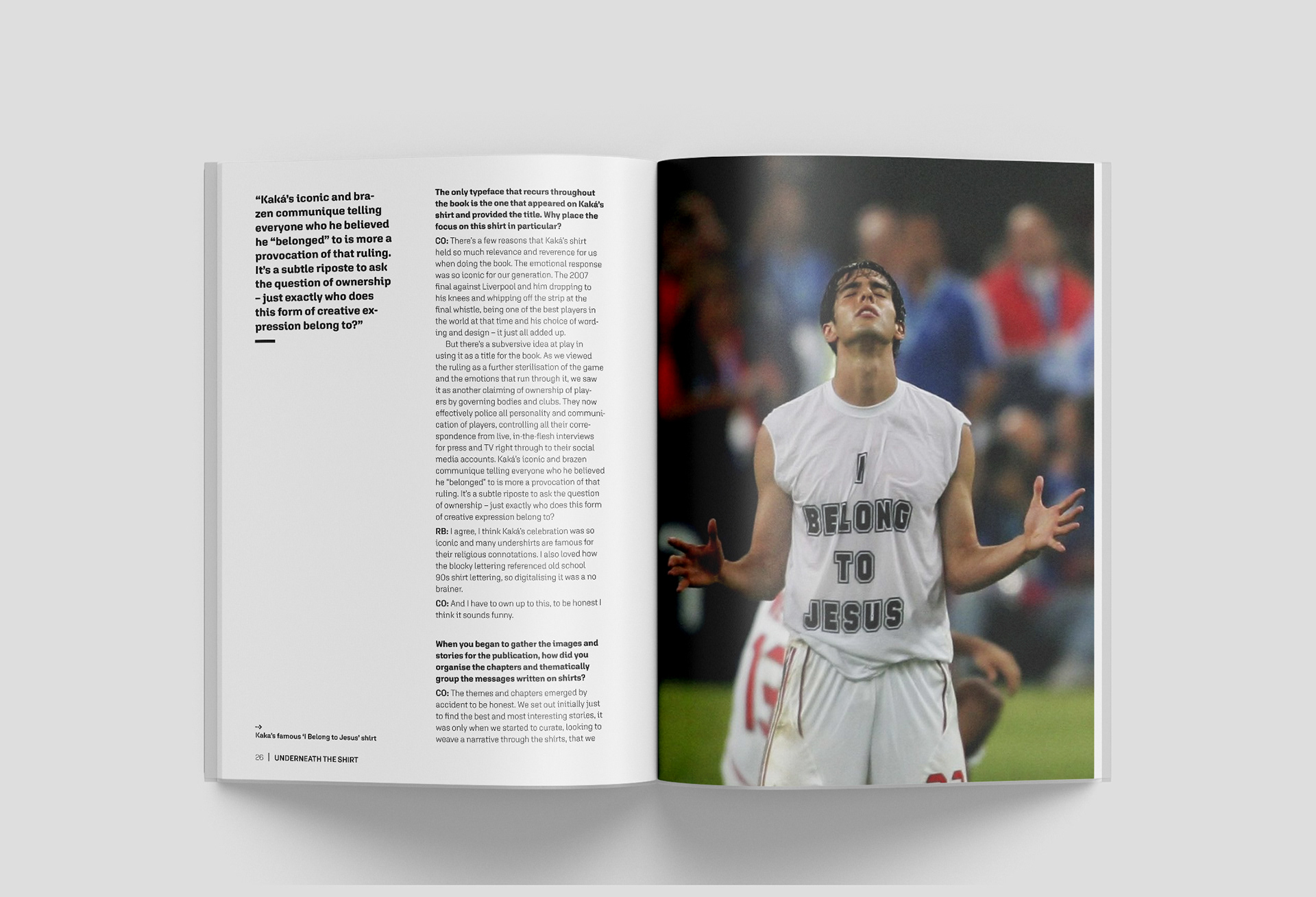
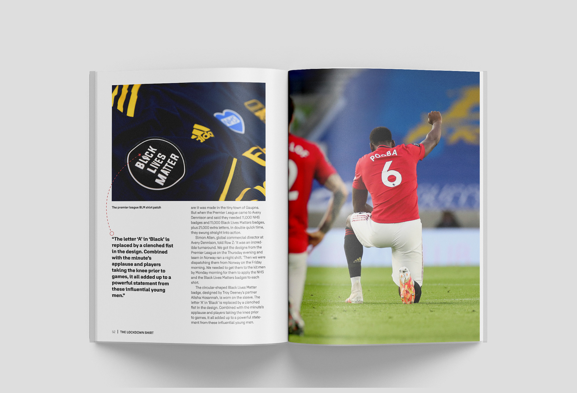
Spread showcasing an example of an interview article within ROW Z.
Close-up detailing a postcard insert for the editors note, designed in the style of a football pitch.
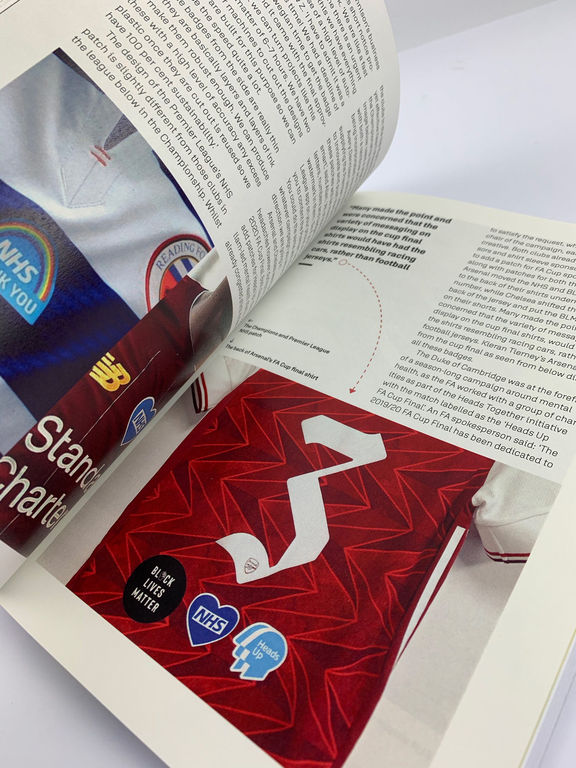
Inside spreads showcasing the use of typographic features such as captions, body copy and pull quotes.
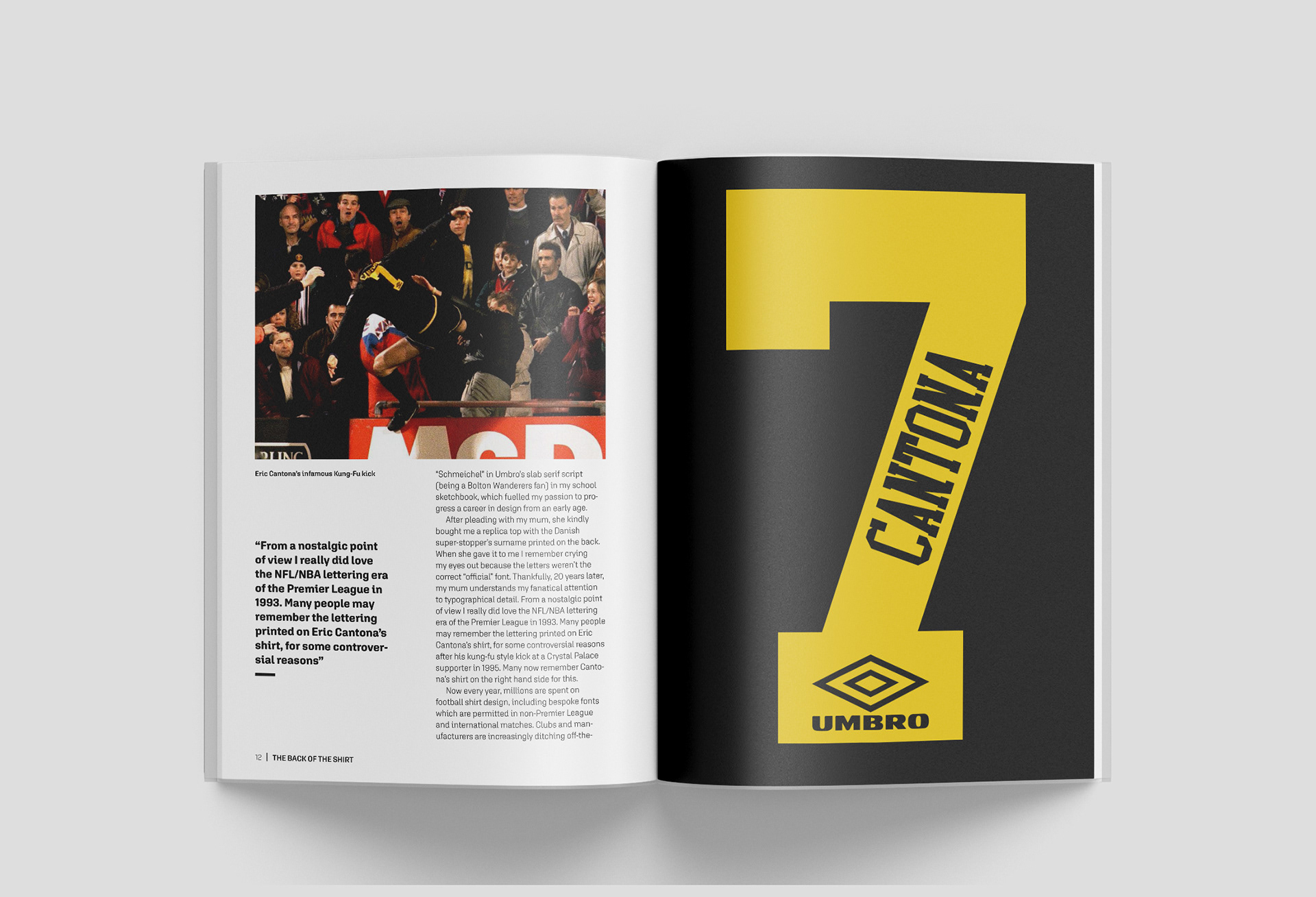
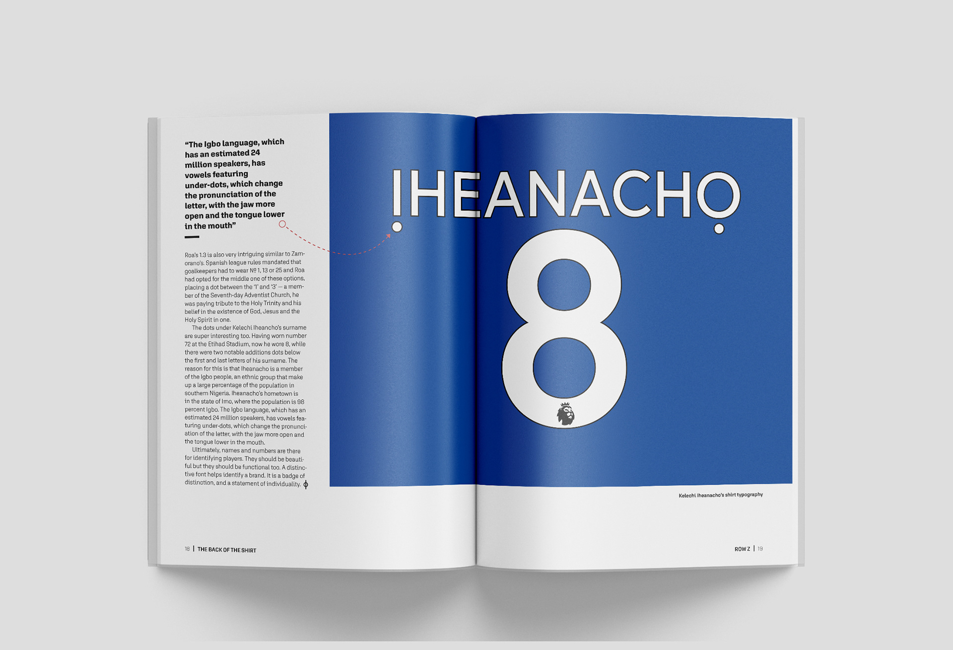
Inside spread detailing typographic additions such as the use of tactical lines to indicate information to the reader.
Have a read through issue one of Row Z