The Circle Collective, are a social enterprise located in both Lewisham and Hackney focused on breaking the cycle of youth unemployment in London, through their employment programmes and schemes, ran by the Circle Community, helping those who are struggling with unemployment, due to a lack of work experience, get real work experience, to provide them with a kick-start in their career. This third year University group project, looked at rebranding the Circle Collective. As a team of 4, this project consisted of rebranding their existing brand and applying it, across a series of deliverables, including their website, marketing collateral and their social media channels. Scroll down to explore the process of rebranding the Circle Collective. My role specifically within this project, consisted of helping to redesign the visual identity for the company and designing the website prototype proposed. A link to our presentation video, has been included, which can be viewed on youtube, which talks through our vision for the Circle Collective and explains all the thinking behind our rationale for Circle Collectives rebrand. The original brand for the Circle Collective can be viewed here. The presentation itself, was designed by myself
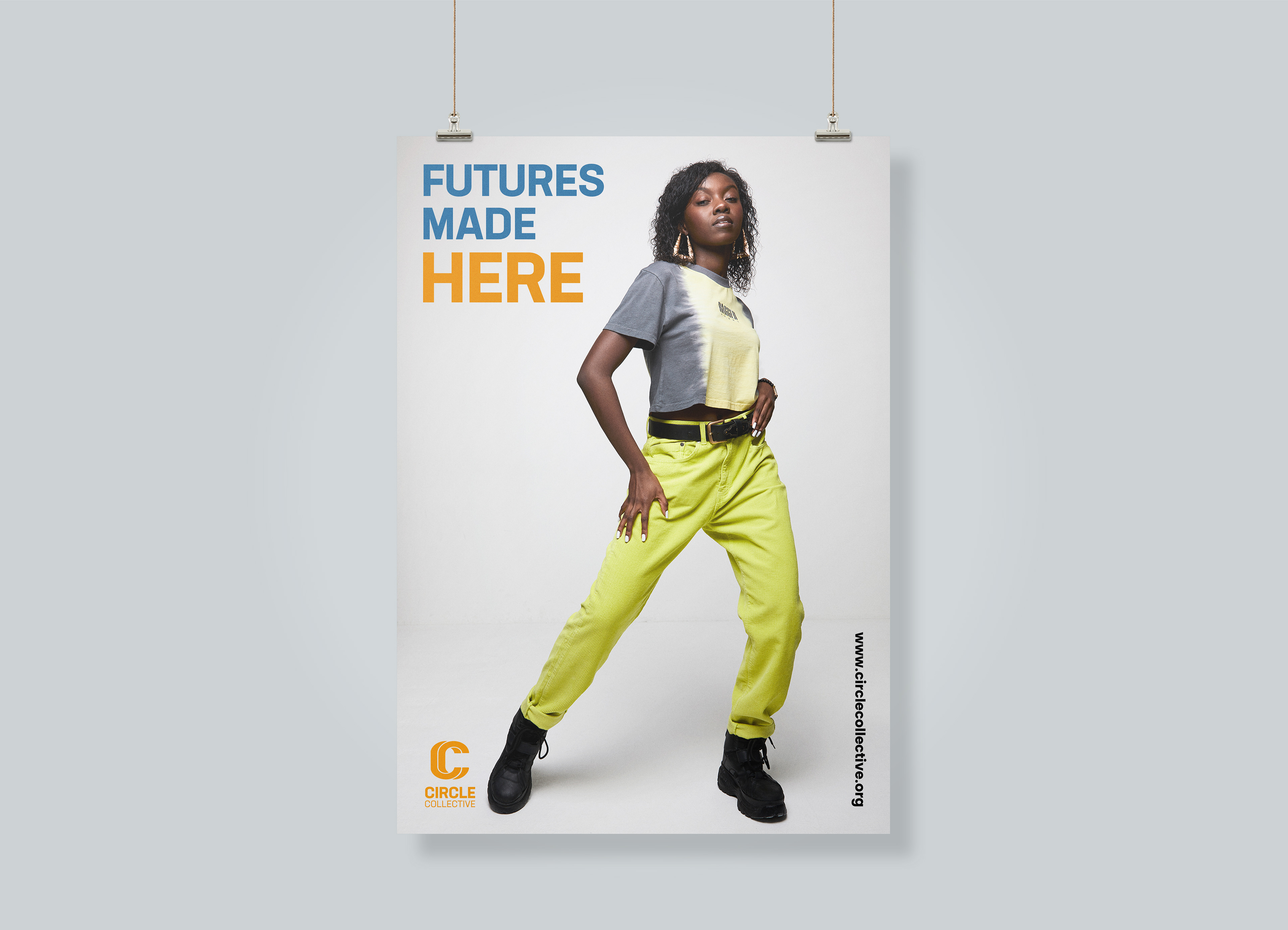
In-store poster advertising the Circle Collective.
Circle Collectives audience
Understanding the audience and who you are designing for is crucial in any project and in particular with this project. With Circle Collective being a social enterprise, the audience and group of users were split between two. There are users who are actively using the 'circle community programmes' as a place to help find employment, whilst there are those are will actively visit the Circle Collective retail store, to purchase some of the latest streetwear brands. User journeys were mapped out, taking building on from personas developed, that represented representatives of these two different user groups. What this highlighted however, was that the rebrand of Circle Collective, would need to find a balance between coming across as both a retail streetwear store and a community organisation.
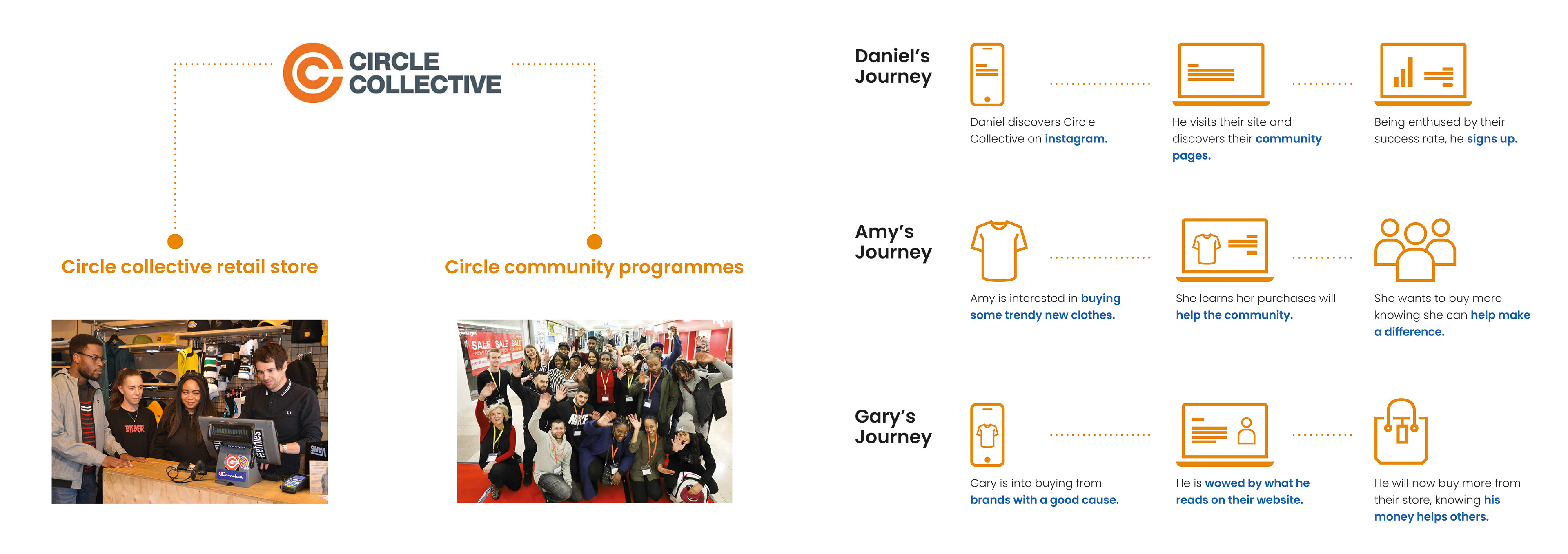
Research board showcasing Circle Collectives two main user groups and a series of user journeys.
Circle Collectives existing brand
Examining the existing brand of Circle Collective, showcased where the brand was falling short. The main issue with the current brand, lied within the fact that their actual logo icon, was not recognisable enough and appeared too generic, which was reaffirmed when it was revealed that there was no rationale behind the logo design. Whilst the use of orange in their existing branding was carried forward, the use of grey alongside a harsh san-serif typeface made the existing identity for the Circle Collective appear rather conservative, which may not be the best impression to give off, especially when the company is a social enterprise.
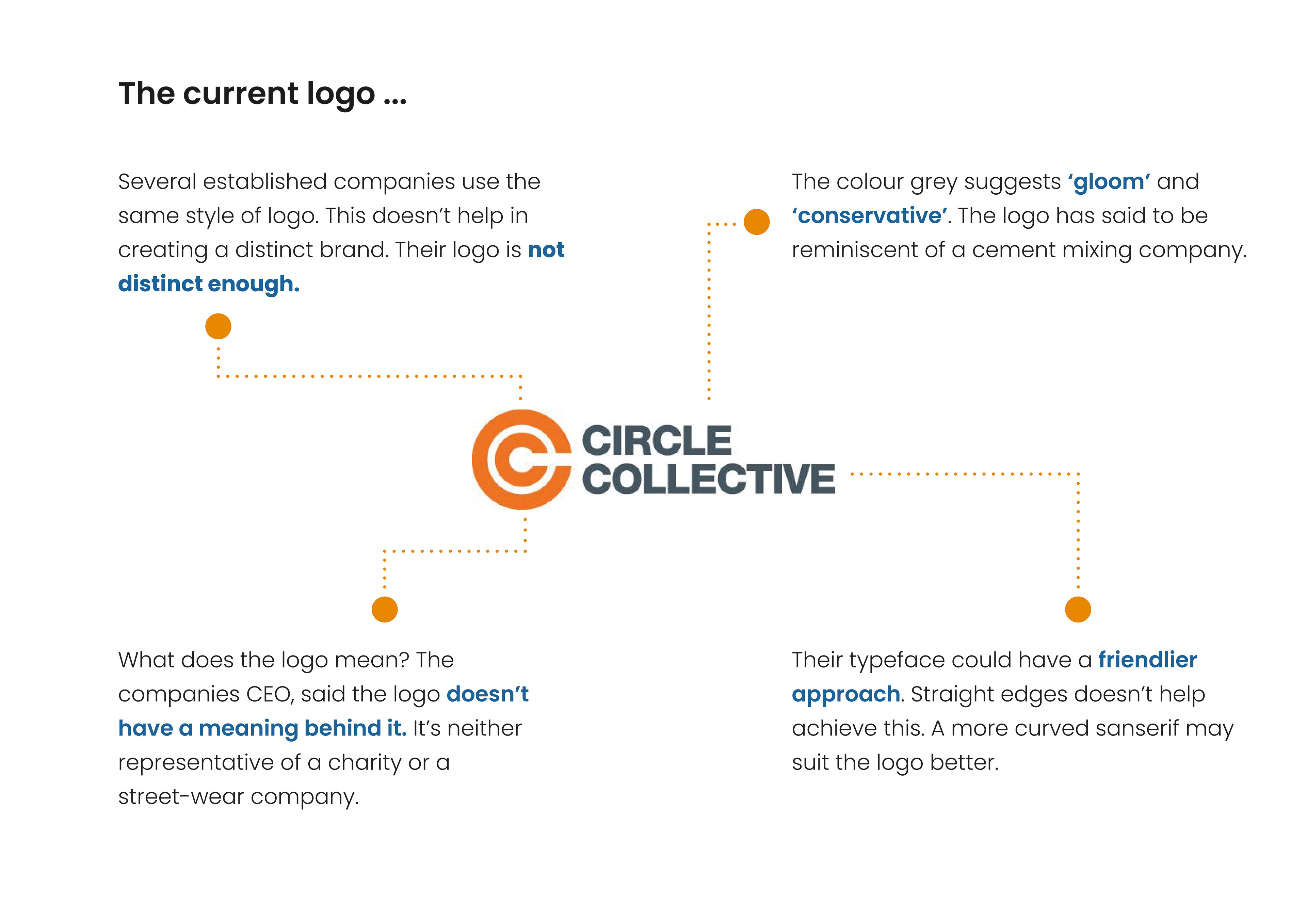
Research board showcasing analysis of the Circle Collectives existing identity.
Circle Collectives exisiting brand
Several identities were drawn up for the redesign of Circle Collectives identity, with many designs still retaining the use of the 'C' as a letterform within the logo. With the preferred logos narrowed down to a selection of 4, user surveys with several responses, indicated that there were two preferred identities for the Circle Collective. One which used a sanserif typeface for the logo, with intersections to give off a streetwear like feel, whilst the other logo used two interlocking C's, which gave off a stronger sense of community within the logo. Both were taken forward and combined.
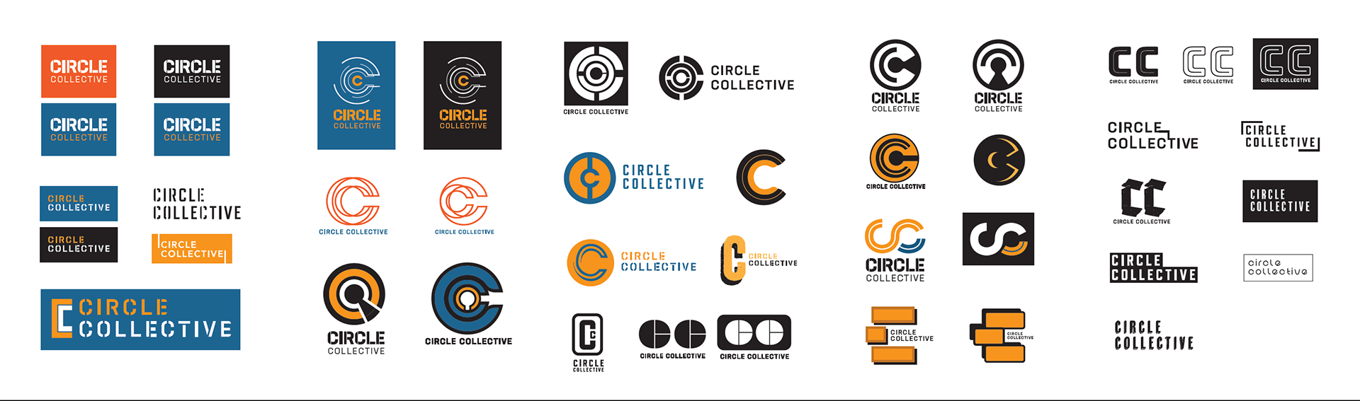
Exploration of a series different logo ideas, for the rebranding of Circle Collectives identity.
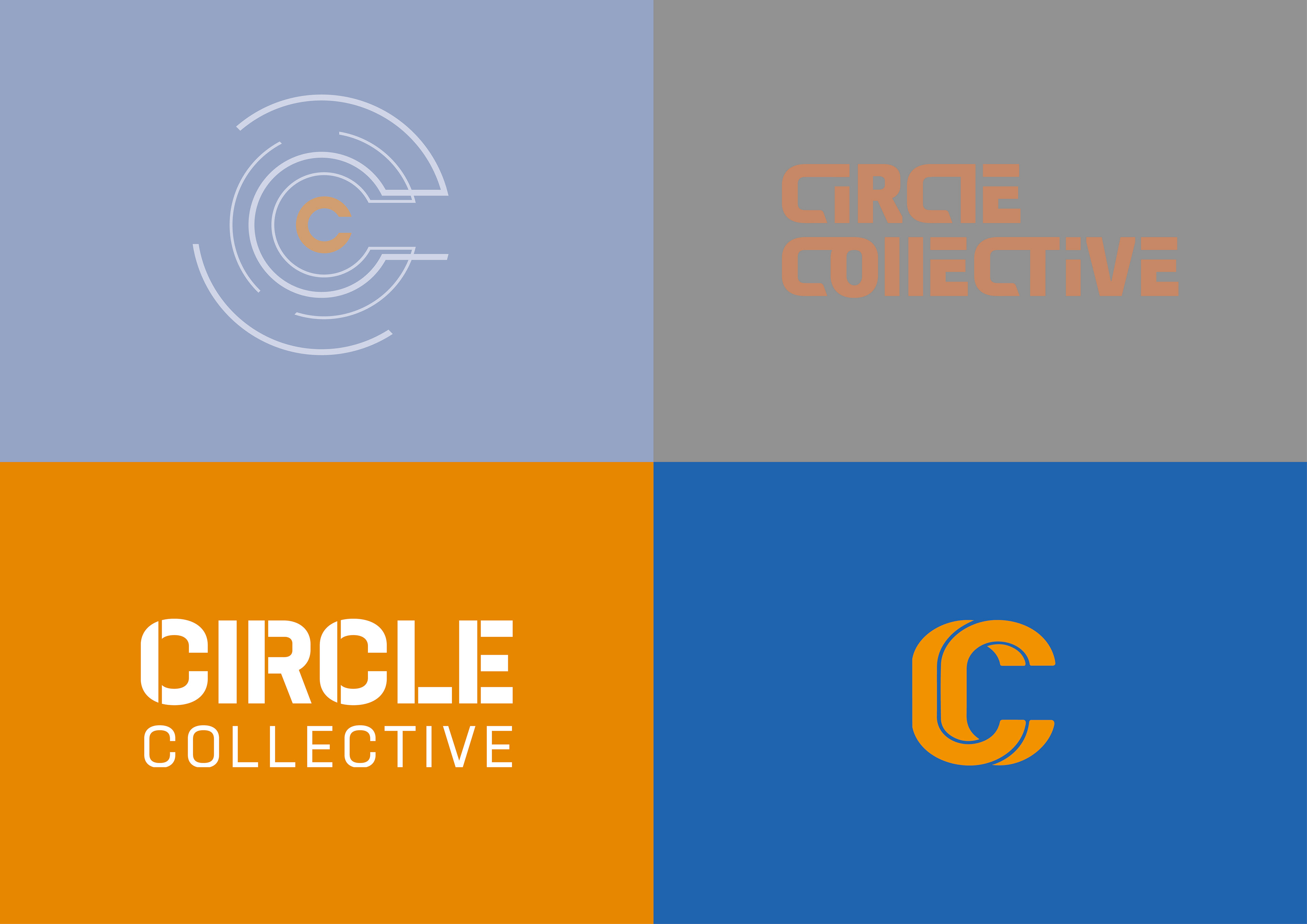
The two logo identity designs which were most preferred, confirmed through the results of user testing.
Circle Collectives rebrand
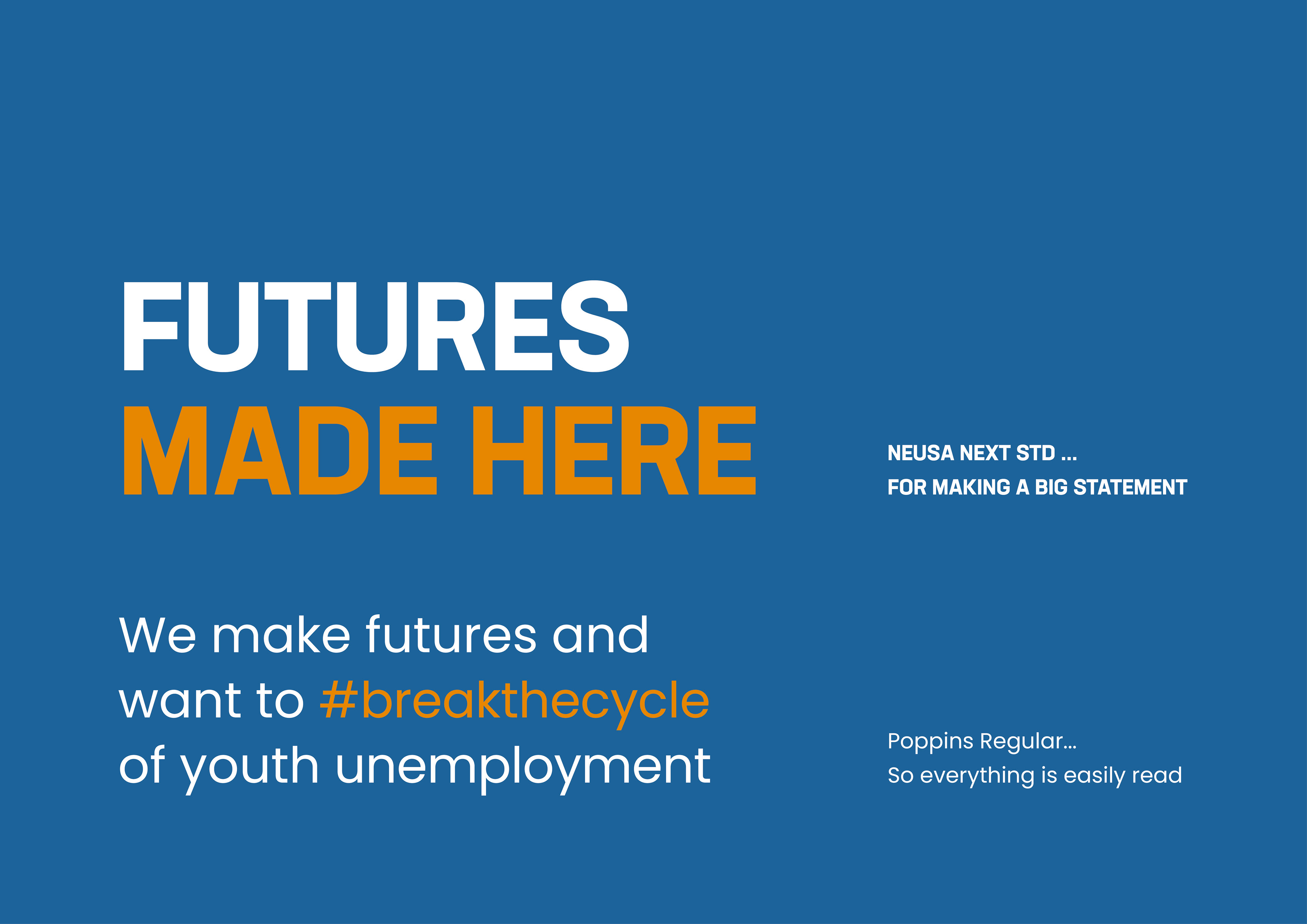
The combination of both identities proved effective, striking a good balance between promoting both the streetwear retail store and the community programmes too, through the design of the logo. The use of the interlocking 'C' highlights the organisations sense of community, whilst the san serif typeface with the curved intersections, retains a streetwear like feel. Both the colour palette and use of typography within the rebrand were also carefully considered. Knowing that the Circle Collective will need to get their messages across in store, be it through posters or billboards, a typeface such as Neusa, would ensure that messages can make an impact and a statement, whilst the use of a colour palette consisting of yellow, orange and blue, conveys feelings of hope, success and trust, which is exactly what Circle Collective bring to those who are looking for employment.
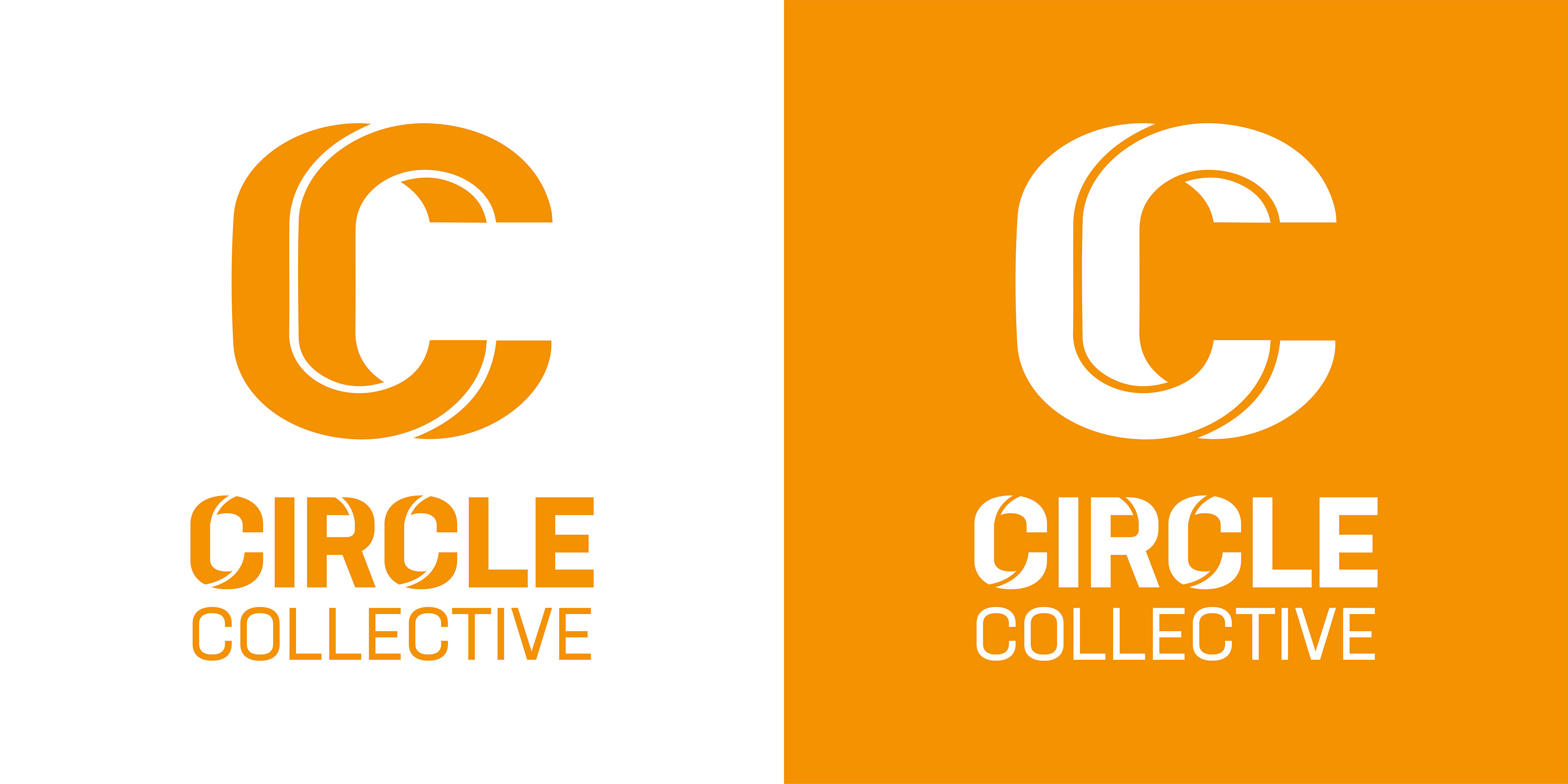
The final identity for the rebrand of Circle Collective.
The two chosen typefaces, used throughout the rebrand for the Circle Collective.
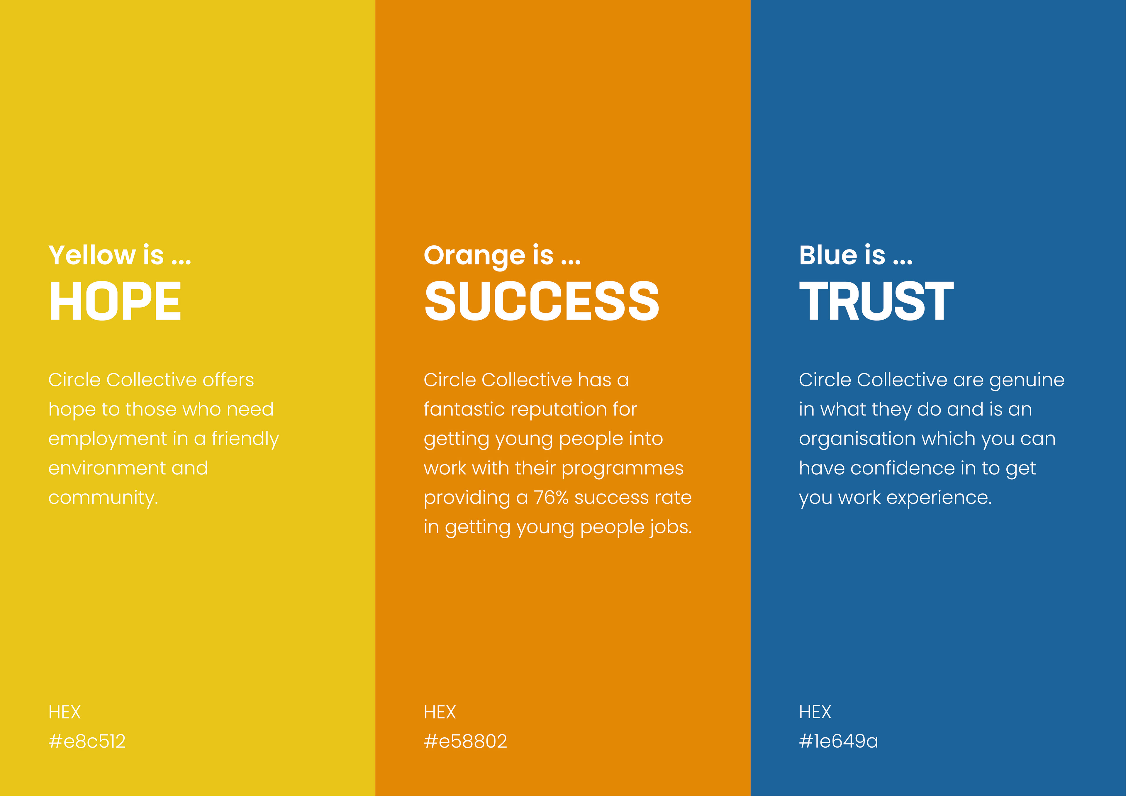
The chosen colour palette, for the rebrand for the Circle Collective.
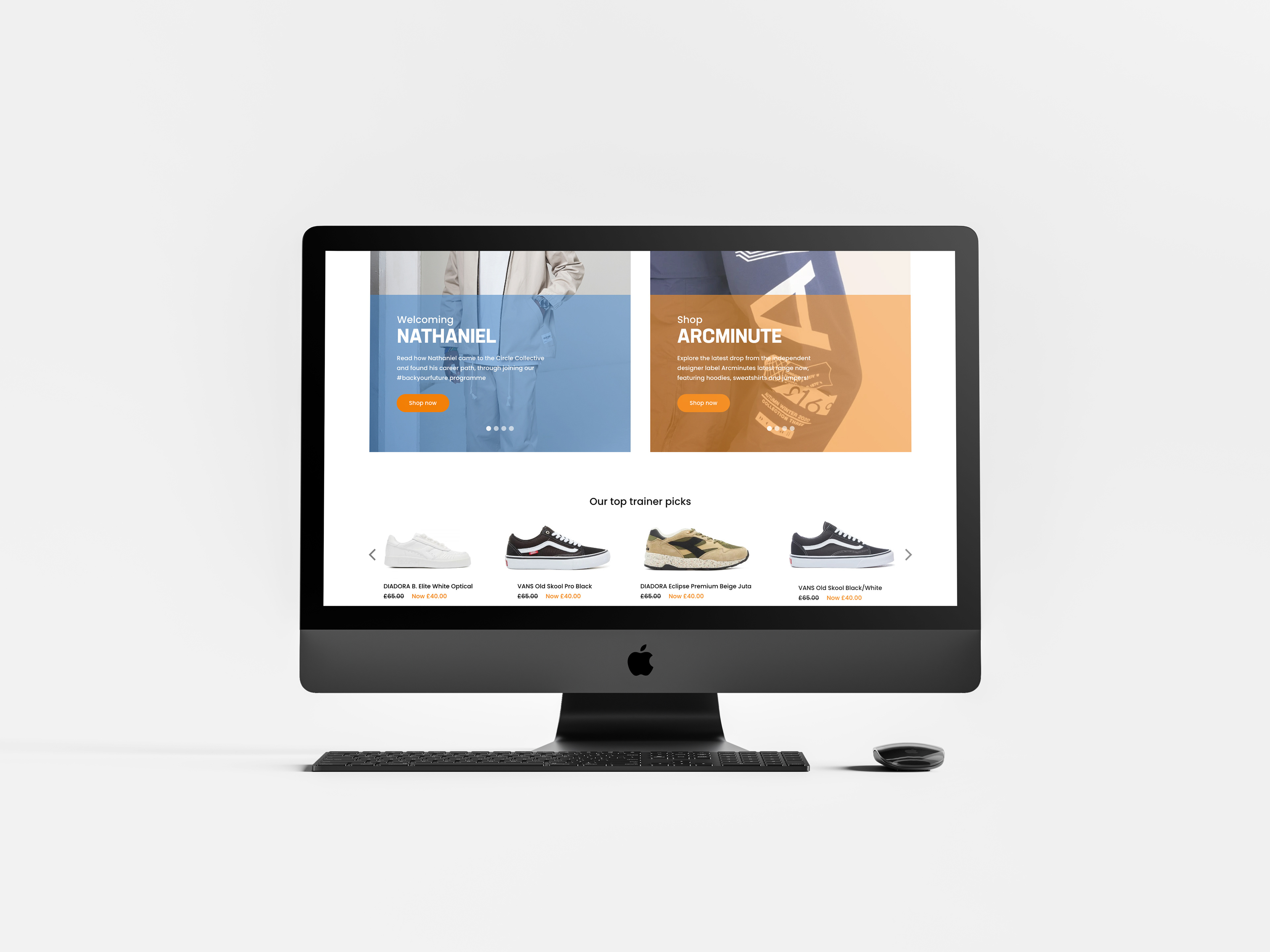
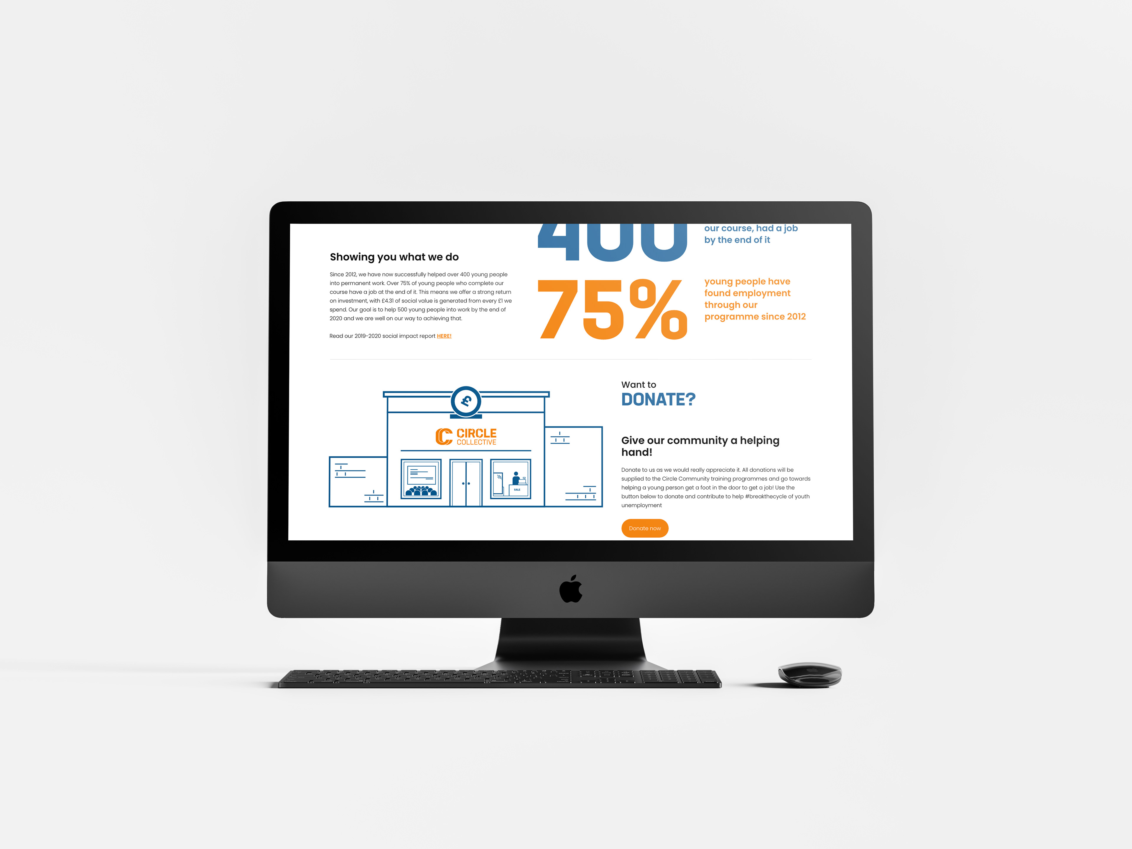
Rebranding Circle Collectives current website
Rebranding Circle Collectives website was a main aim for the project. Their current website did not seem to advertise the excellent work their community do and the programmes that they run in reducing youth unemployment, with the information fairly hidden within the website. This needed to change. Therefore, with an identity in place ready to be applied to a series of deliverables, with the website redesign, the information and content was split evenly, advertising both the retail and community aspects in equal measure and promoting more of the good work the company do and the impact they have had, with clear and accessible links to their community projects, as showcased by the website walkthrough and images. Click here to view the live working prototype for the website!
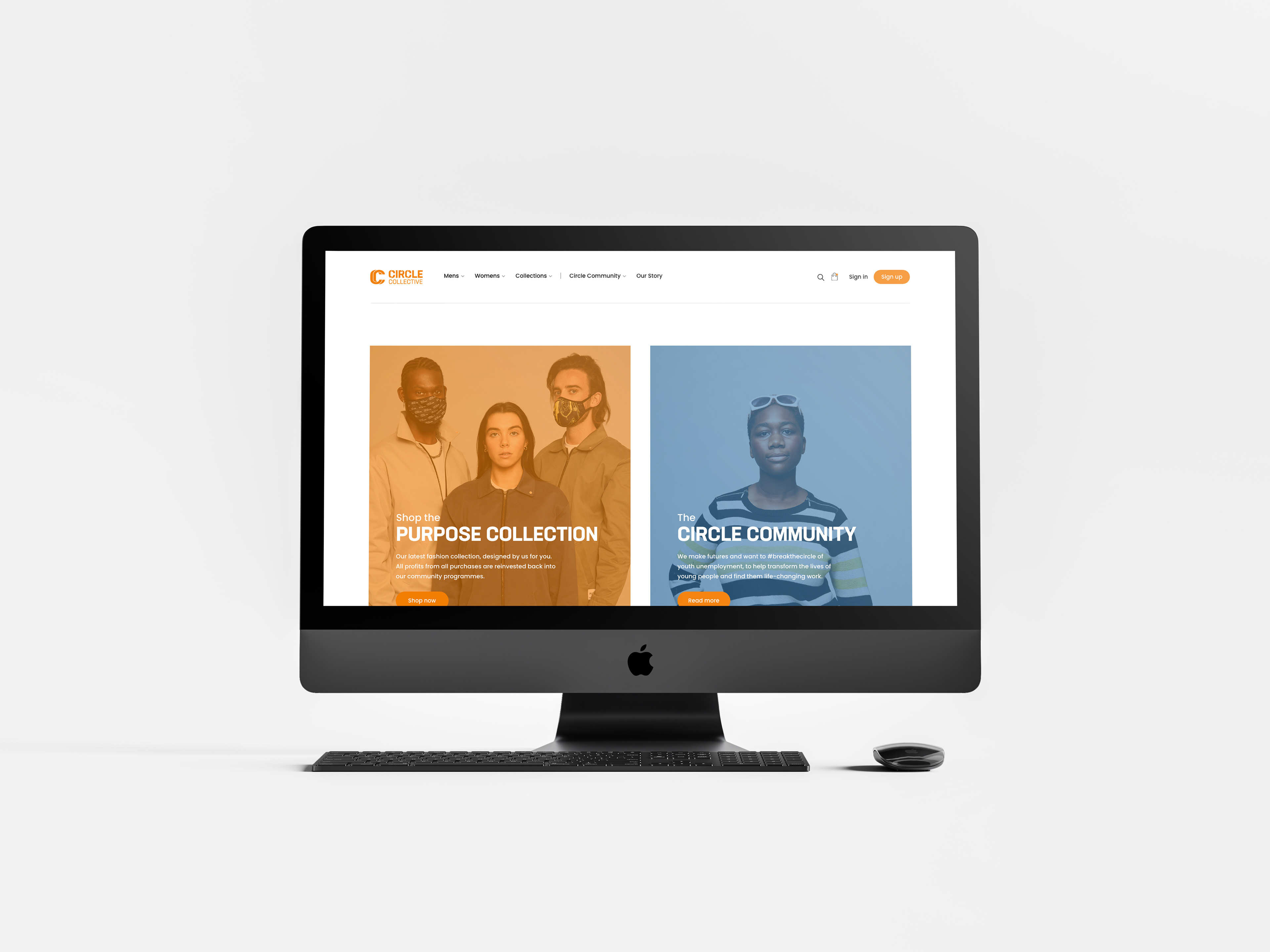
The rebranded homepage for Circle Collectives website.
The homepage.
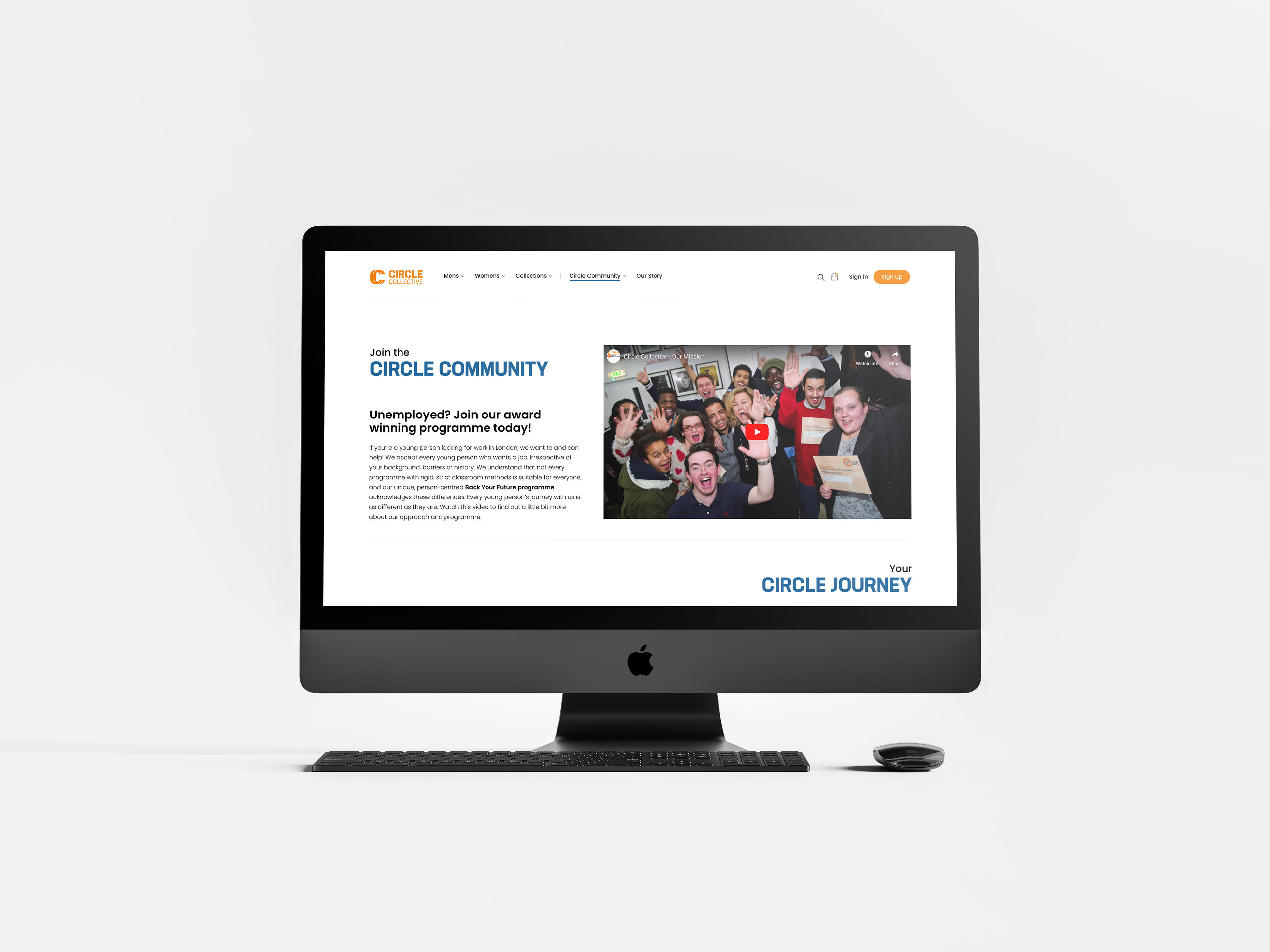
The 'join the community' page.
The 'join the community'' page.
Website walkthrough of the rebranded website for Circle Collective.
Marketing collateral and in-store merchandising
In-store merchandising, was another important application of the Circle Collective rebrand, using the identity created, to promote the community programmes and the impact they have had, especially through the use of the tagline 'Futures Made Here'. Thinking closely about our audience, we decided not only to apply the rebrand to posters, that would be pasted up in store and in billboards around London, but also on physical items such as sale tags, which would directly educate the audience of retail shoppers, the good impact Circle Collective are having.
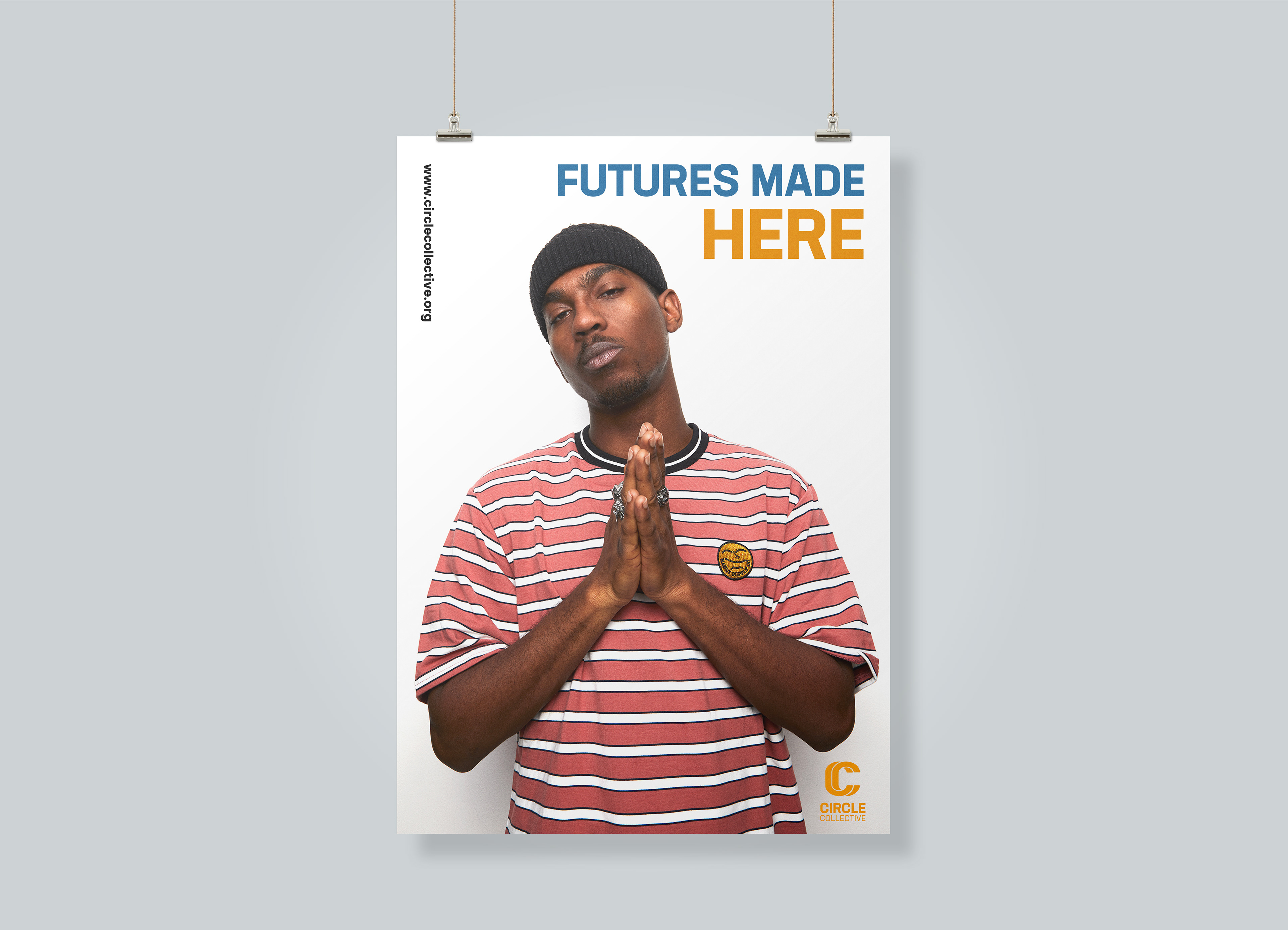
In-store poster for Circle Collective.
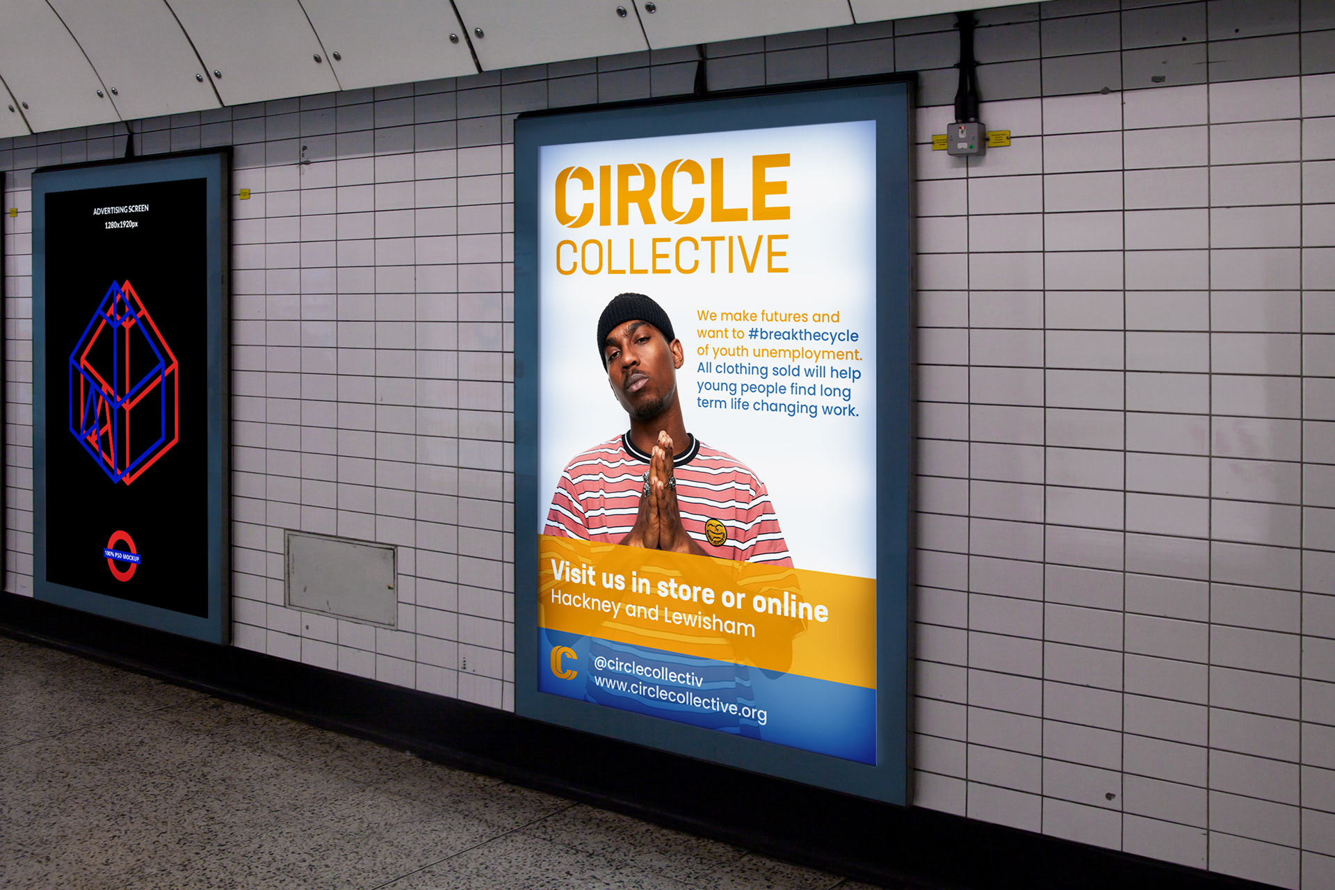
Underground billboard mockup.
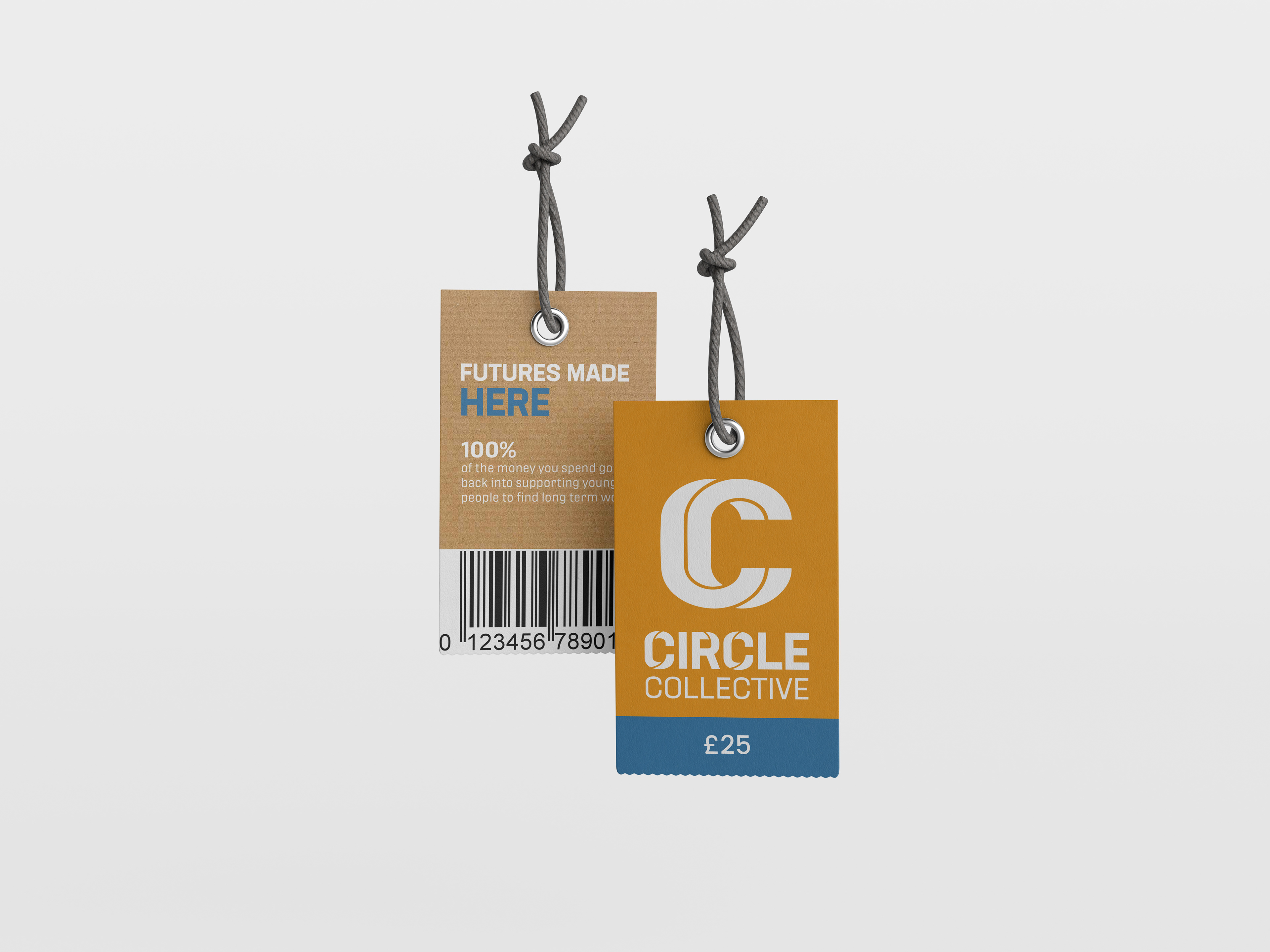
In-store sales tag mockup.
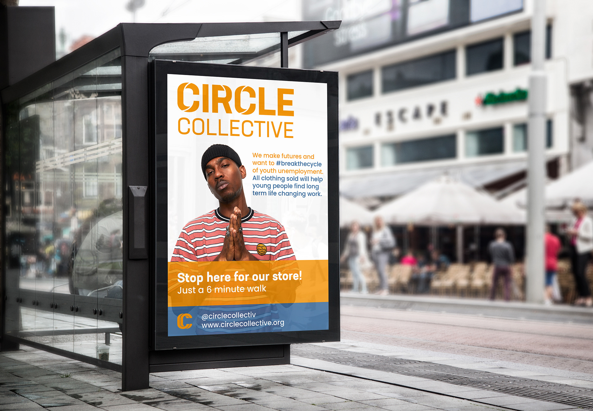
Billboard mockup advertising Circle Collective.
Social media branding and application
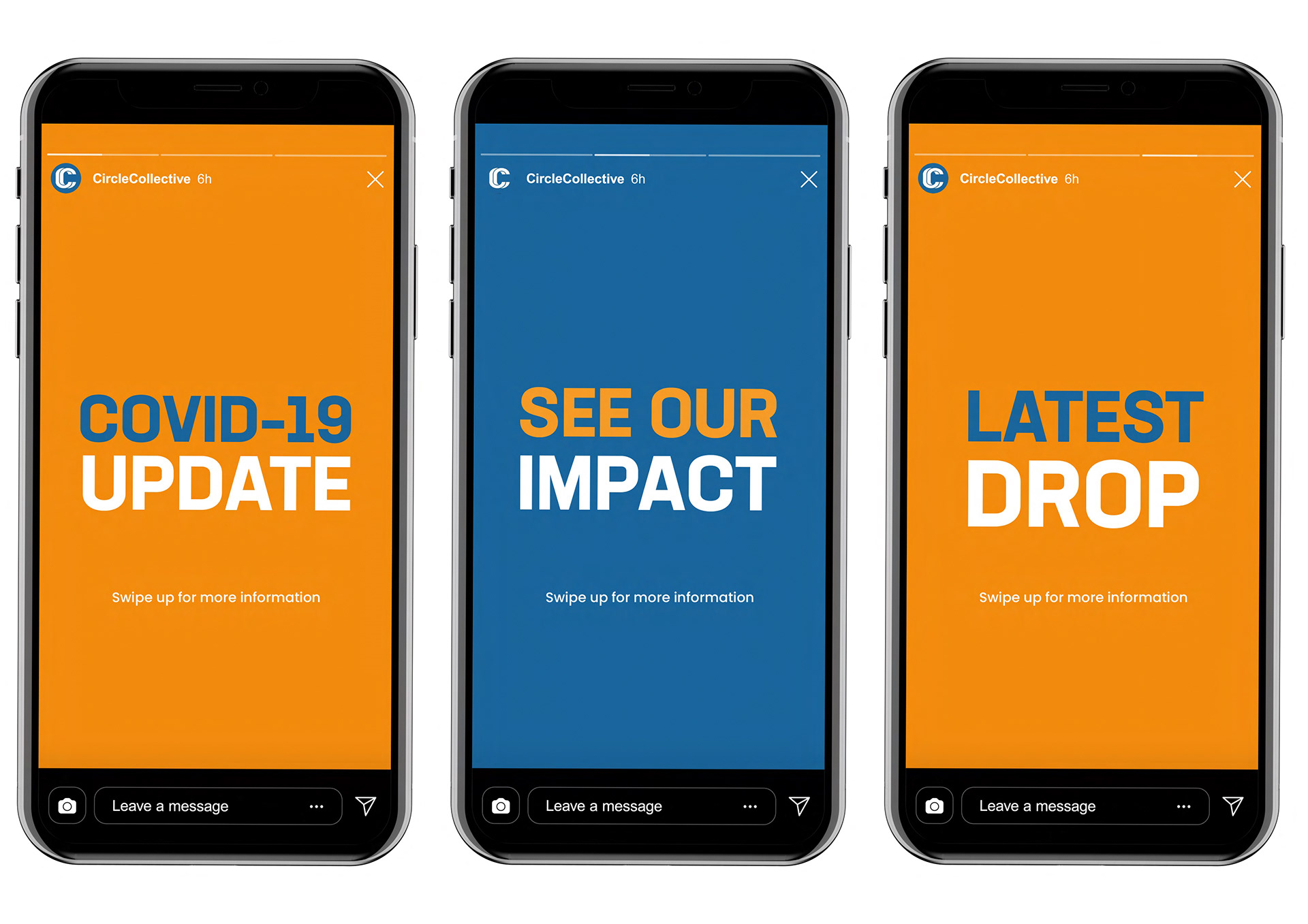
With the audience of Circle Collective being a fairly young demographic, the application of the rebrand across social media channels such as Instagram in particular, as seen from below, was vital in order to engage actively with our intended audience of users, which the existing brand, was failing to do. As highlighted below, a mixture of stories and posts, would be used effectively, to not only advertise new fashion drops and the release of new clothing, but actively help to showcase the work of the Circle Community, through specially branded posts, that would advertise the impact of the community, through the use of success posts and stories which congratulate those who have been on the course.
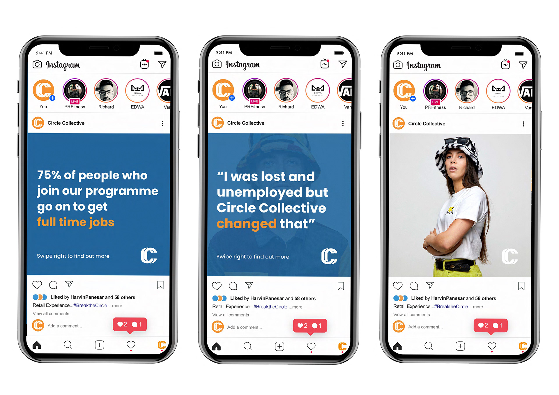
Example of Circle Collectives instagram posts
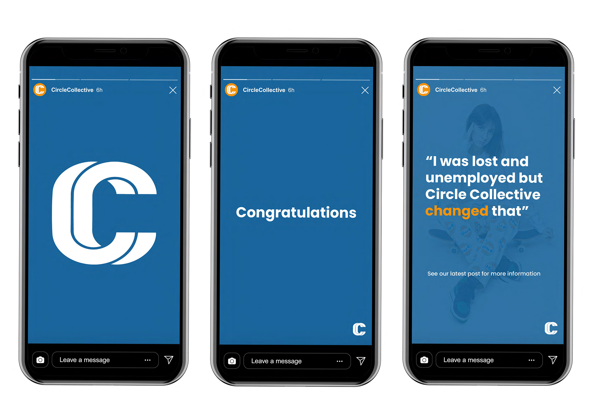
Example of Circle Collectives Instagram story posts.
The brand toolkit for Circle Collective