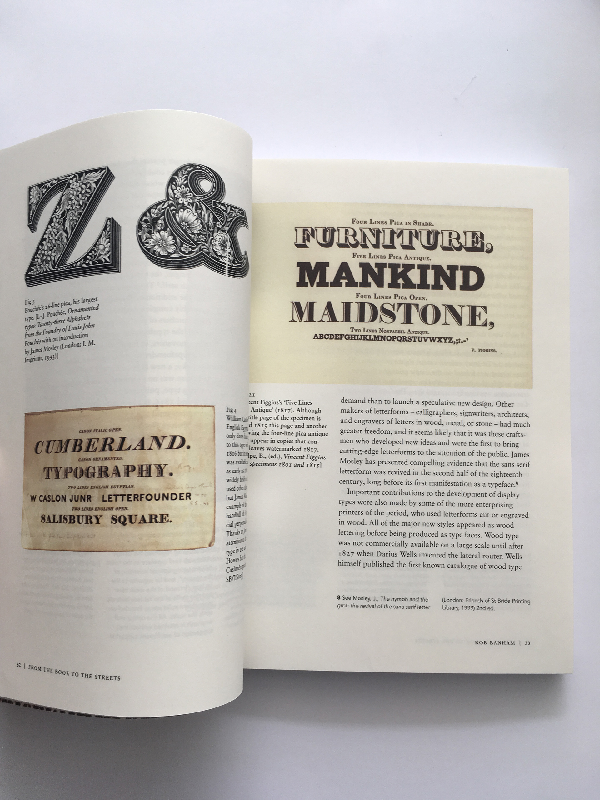
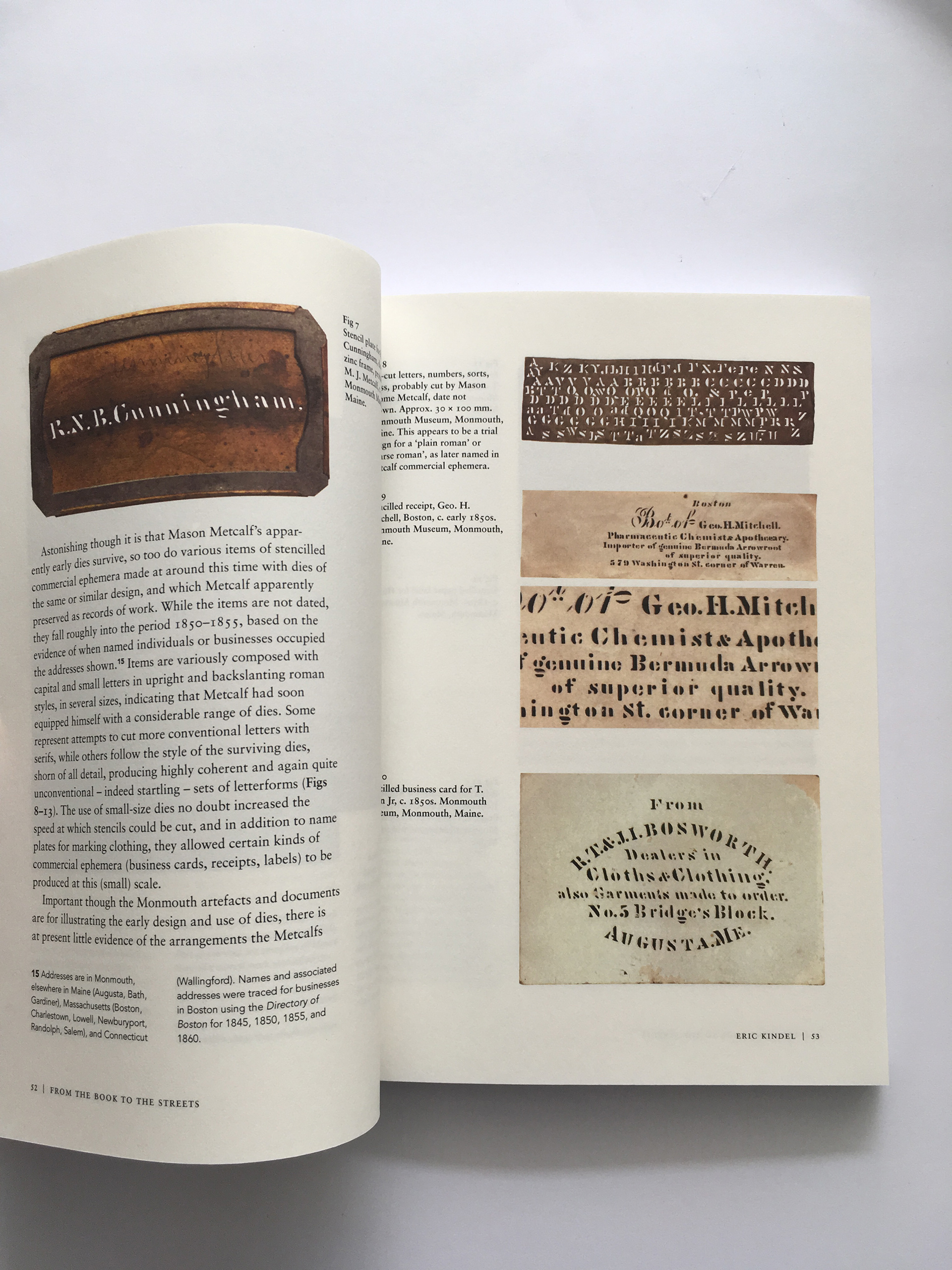
A first year University project, which focused on designing and hand-crafting a book named: 'From the book to the streets: large type in public spaces'. The project consisted of designing a typographic themed cover for the book, alongside designing a selection of the inside pages. These pages were typeset using the copy which we had been provided with for this project. The project placed a strong focus on understanding the importance of a books format, layout and relationship between text and image. A particular focus was placed on understanding how to handle more complex typographic elements such as footnotes, captions and pull quotes, which can be seen from some of the books spreads from below. The book is perfect bound and includes a deboss finish on the front of the cover across the words 'TYPE', as showcased below. A finish such as this, adds to the users experience of reading the book. The effect, was used as it somewhat reflects the content of the inside pages. The book itself, writes about the history of wooden and stencil type. The effect is supposed to make reference to letterpress printing, an impression would often be left once printed, hence why a deboss effect seemed fitting for the cover of the book.
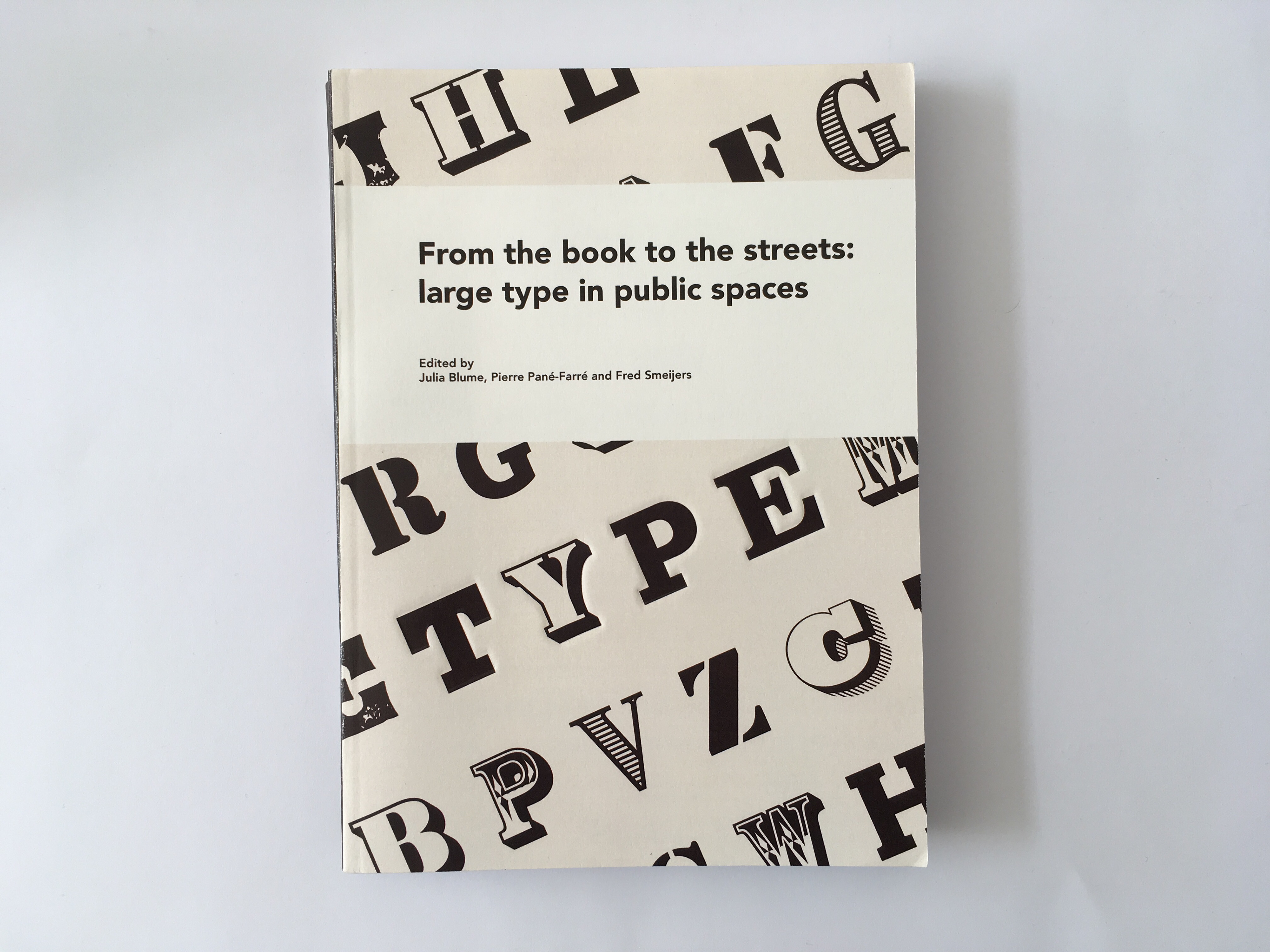
Front cover of the book.
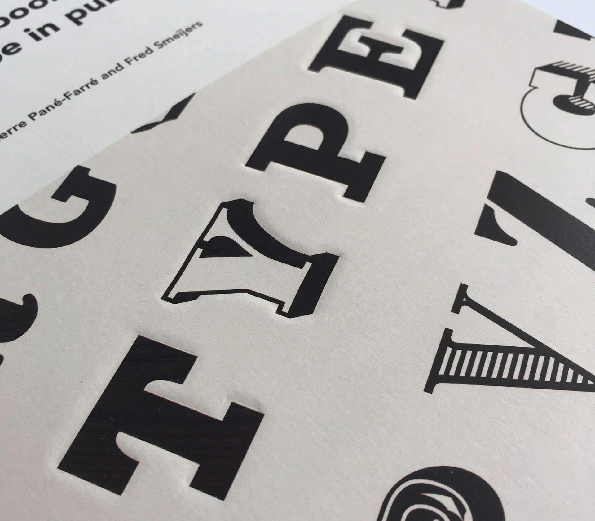
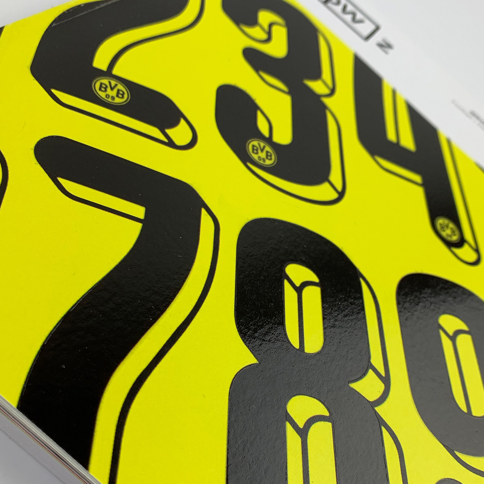
Image showcasing a deboss finish applied across the words 'TYPE' on the front cover.
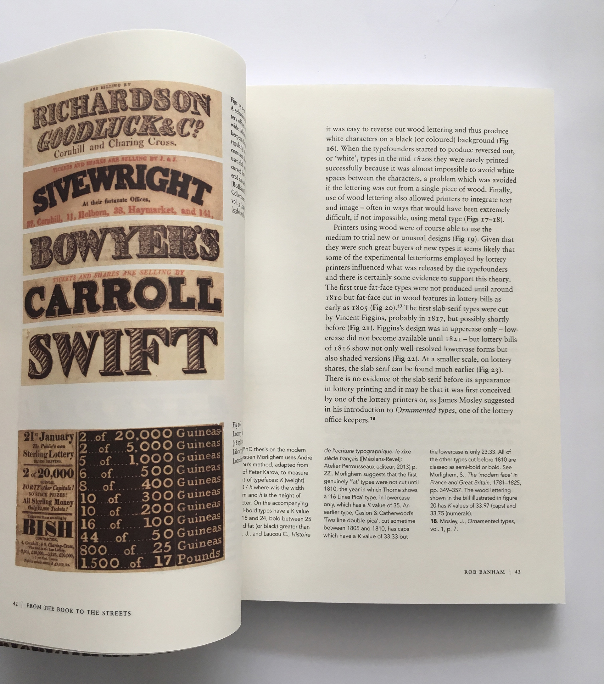
Inside text spread showcasing the typographic handling of body copy, footnotes, captions and folios.
Prelims
Text spread
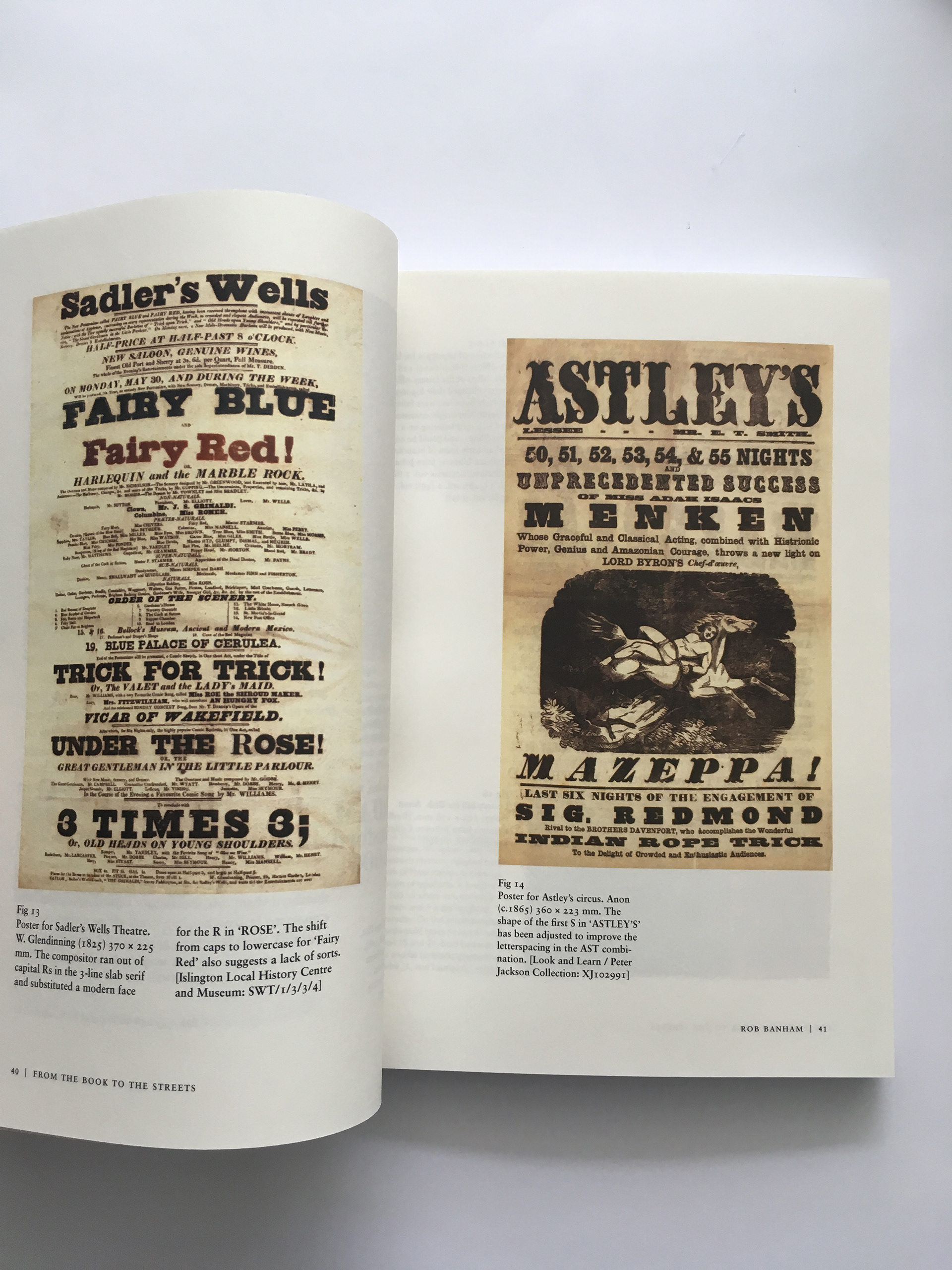
Image spread
Text spread
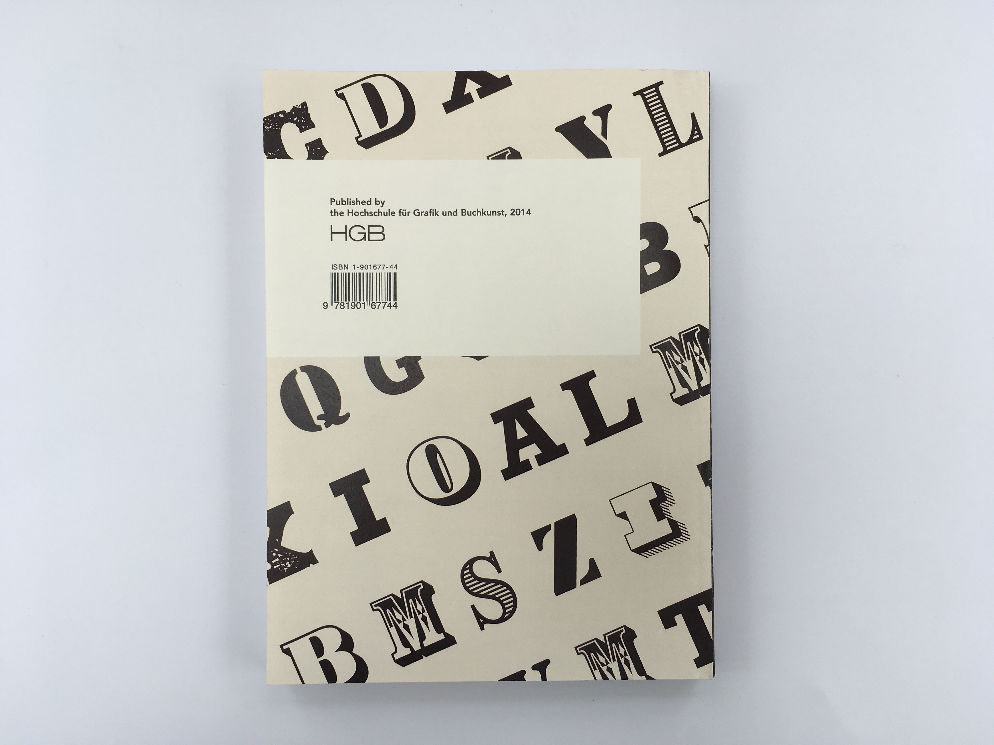
Back cover of the book.